Stripes

Redesigning a health tracker caregivers could actually use.

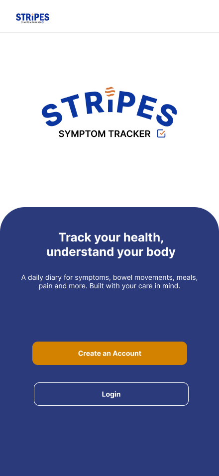
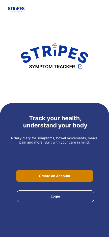
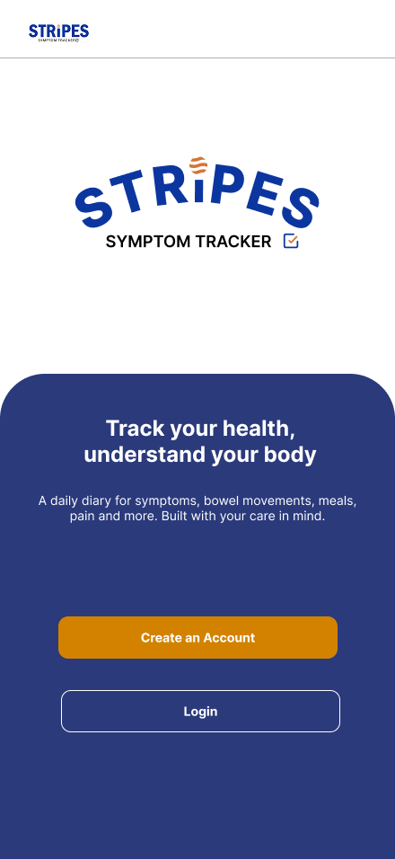
STRIPES onboarding welcome screen

STRIPES is a daily symptom-tracking app for caregivers of people with neurodevelopmental conditions. It turns quick daily check-ins into a clear, consistent health record — capturing the symptoms and patterns that matter most to share with clinicians.

01 — Overview

A redesign measured in data quality,
not just a new look.

STRIPES is a caregiver-facing symptom tracker for logging GI symptoms, meals, mood, bowel movements, and clinical motility-study data — used by caregivers recording for people with Phelan‑McDermid Syndrome who often can't report symptoms themselves.

Role
Team Lead
Methods
Cognitive Walkthrough · Moderated Usability Testing
Scope
Research, synthesis, and redesign of core flows
Timeline
6 weeks · Research, testing, and redesign

Why it mattered

STRIPES helps caregivers record health information for people who may not be able to report symptoms themselves. When logging was unclear, the risk was bigger than frustration: entries could be skipped, symptoms could be mis-recorded, and patterns could be missed over time.

This made the redesign a data-quality problem, not just a visual refresh.

The approach

Our team evaluated six core tasks using a cognitive walkthrough and moderated usability testing. We compared findings across both methods, then prioritized issues by task impact, severity, and overlap.

This led to 17 prioritized usability issues tied to caregiver confidence, task completion, and data accuracy.

What we redesigned

We focused on three core flows:

  • Home — clearer orientation and next steps
  • Symptom logging — more guided data entry
  • History review — easier access to past entries and patterns

The outcome

The redesign created a clearer end-to-end experience: caregivers could better understand where to start, log information with less uncertainty, and return later to review changes over time.

02 — Problem

STRIPES needed clearer workflows for reliable caregiver symptom tracking.

STRIPES depended on caregivers entering clear, consistent symptom data over time. However, the original experience made key tasks harder than they needed to be, especially around finding where to start, understanding the Blue Meal Study flow, logging symptoms accurately, and reviewing past entries.

Before redesigning, our team needed to understand where the experience was breaking down and why. We focused on four questions:

  • Where did users hesitate or get confused?
  • Which tasks caused the most friction?
  • What information did caregivers need before, during, and after logging?
  • Which issues appeared across more than one research method?

These breakdowns mattered because STRIPES is not just a general tracking tool. Caregivers use it to record health information for people who may not be able to self-report. When the workflow is unclear, users may skip steps, misinterpret instructions, or miss entries — which can affect the quality of the symptom data being collected.

— Why this mattered

What we found

Across the Cognitive Walkthrough and Usability Testing, usability issues were consistent across participants and focused on structure, flow, and clarity. Many of the issues prevented users from completing tasks confidently without moderator support.

Most frequent problems
  • Difficulty finding study information and starting points
  • Confusion between study tasks and symptom recording
  • Unclear workflow progression
  • Input fields and symptom logging moments that lacked enough guidance
Most severe problems
  • Users could not find where to start the Blue Meal Study
  • The experience lacked onboarding and clear instructions
  • Terminology and labels were unclear
  • Key actions had weak visual hierarchy
  • Forms did not always explain what users needed to enter

Root causes

Across the research, the issues pointed to five root causes:

Start & discoverability

Users did not know where the study began or where key study information could be found.

Study vs. Record split

The product model did not match the user's mental model. STRIPES separated study information from recording tasks, but users expected one guided flow.

Guidance & terminology

Medical language, missing onboarding, and weak explanations left users unsure what the app was for and what they were supposed to do next.

Inputs & symptom fit

Scales, fields, and symptom options did not always reflect real caregiver experiences or edge cases.

Visibility & trust

Important actions were visually weak, and unclear system feedback reduced confidence in whether tasks were completed correctly.

Problems Breakdown

The current experience led users straight into Start Recording Symptoms without clearly introducing the Blue Meal Study, its purpose, or the required steps. Because the product did not provide enough guidance on its own, users relied on moderator instructions and task prompts to understand what to do.

The repeated breakdown

  1. 1
    Users entered the recording flow first

    The recording screen appeared to be the main starting point, so users began logging symptoms before understanding the study context.

  2. 2
    Users could not find or understand the Blue Meal Study

    Study information, instructions, and requirements were not visible enough for users to follow independently.

  3. 3
    Users continued incorrectly

    Without clear feedback, progress indicators, or step-by-step guidance, users could not tell whether they were following the study correctly.

  4. 4
    Key steps were skipped

    Users missed critical study requirements, including fasting, timing, and the required wait period.

The biggest issue was not just navigation. It was the way the product separated "study" and "recording," while users expected one continuous guided experience.

Problem statement

Caregivers needed a clearer, more guided way to understand study requirements, log symptom information, and review past entries so they could record health data with greater confidence and consistency.

Design opportunity

How might we improve the home, symptom logging, and history review flows so caregivers can understand where to start, enter information accurately, and return later to make sense of what changed?

03 — The Goal

What the redesign set out to do

With the breakdown understood, the work focused on one outcome: turning a fragmented experience into a single, guided flow. Three goals shaped the redesign.

Show people where to start

Give caregivers a clear starting point and an obvious next step, so they always know where they are in the study.

Make logging accurate

Reduce uncertainty during entry with clearer fields, language, and guidance, so the data recorded reflects what really happened.

Reveal change over time

Make past entries easy to revisit, so caregivers and clinicians can recognize patterns and understand what changed.

Process

From sketch
to screen.

The calm check-in didn't arrive fully formed — it started rough, got sharper through testing, and shed steps along the way.

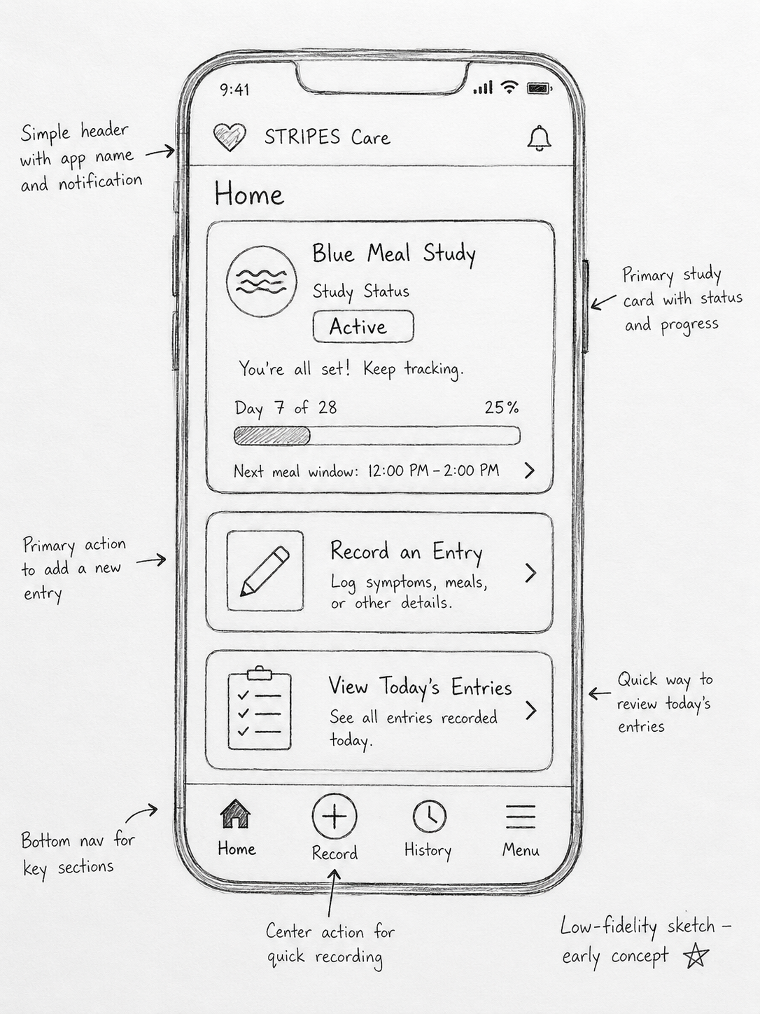
Lo-fi · sketch Hand-drawn low-fidelity sketch of the STRIPES Care home screen with annotations
Pen-and-paper layouts to find the shortest path to a daily log.
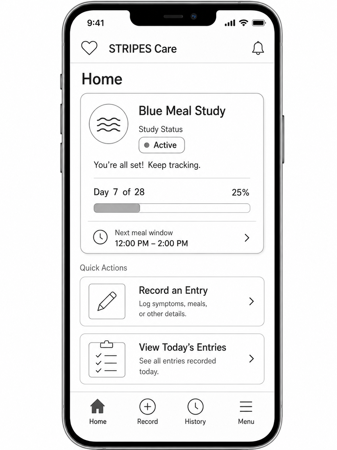
Mid-fi · wireframe Greyscale mid-fidelity wireframe of the STRIPES Care home screen on a phone
Greyscale structure to test hierarchy and the one-tap flow.
Hi-fi · final
Hi-fi final design of the STRIPES onboarding screen
The shipped feel: warm, calm, and reassuring by default.
What changed

The first build asked for a 1–5 skin rating every day. Testers found it fussy, so it became a single “How's your skin?” tap — the finer detail moved into an optional follow-up.

03 — Design Approach

Turn two disconnected systems into one guided caregiver workflow.

Testing pointed to one root issue: STRIPES behaved like two products — a study and a recording tool — while caregivers expected a single, continuous flow. So the redesign focused less on individual screens and more on the path between them: orienting caregivers before they log, guiding each entry, and making it easy to return and review. Each strategy below maps to a prioritized usability issue.

01

One guided flow, not two systems

Merge the study and the recording experience into a single path, so caregivers always know where they are and what comes next — directly answering the study-vs-record split that caused the most confusion.

02

Orient before logging

Lead with a real home screen that surfaces the study, the day's tasks, and a clear starting point, so caregivers no longer drop straight into recording without context.

03

Plain language over clinical terms

Replace medical terminology and assumed knowledge with caregiver-friendly wording and lightweight, in-context guidance, so users always understand what a step is for.

04

Inputs that fit real caregiving

Reshape scales, fields, and symptom options around how caregivers actually observe and report — including the edge cases the original inputs missed.

05

Visible progress and trust

Make key actions prominent and show what's done, what's left, and whether users are on track — rebuilding the confidence that weak visibility and lingering technical issues had eroded.

06 — Outcome

A clearer mobile redesign direction for caregiver symptom tracking.

A research-backed redesign that moves STRIPES from a web app to a guided, mobile-first workflow built around how caregivers actually log symptoms — quickly, in the moment, often under stress.

TL;DR

From a dense desktop tool where users got lost between study tasks and daily logging — to a mobile experience with one clear home, a guided Blue Meal Study flow, and faster symptom entry and review.

What was breaking
  • Couldn't find Blue Meal Study info
  • Study tasks felt disconnected from daily logging
  • Hard to progress through required study steps
  • Confusing terminology (BMS, Motility, Transit Time)
  • No confirmation that an action was done
What mobile unlocked
  • Quick access in the moment of need
  • Focused, one-task-at-a-time screens
  • Clear hierarchy: what now, what to record, what to review
  • Plain-language labels and inline guidance
  • Visible study progress and entry confirmations

Why it matters: STRIPES supports caregivers recording for patients who can't self-report in GI research studies. Unclear workflows don't just frustrate — they produce skipped steps and weaker clinical data. The shift from desktop to mobile wasn't a format change; it was a workflow change — a chance to rethink navigation, hierarchy, guidance, and feedback around real caregiver use.

What changed in the redesign direction

Home and orientation

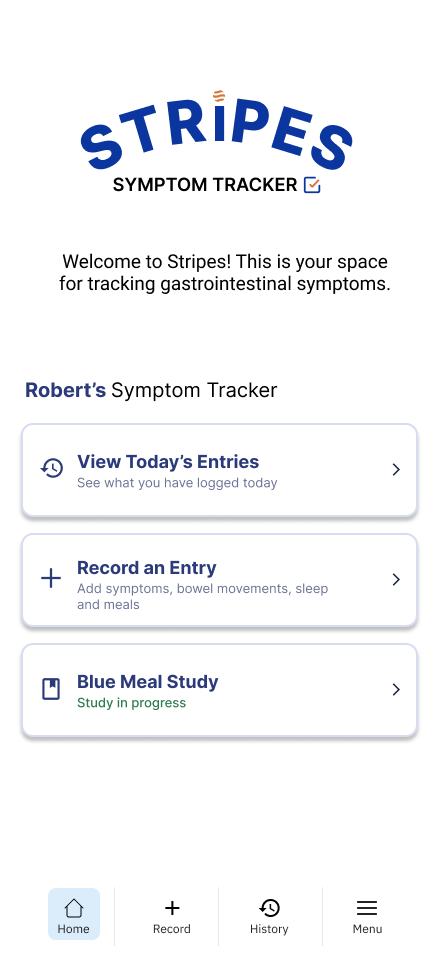
The home screen became the caregiver's starting point. Instead of requiring users to search for study information or guess where to begin, the redesigned mobile home focused on showing active study status, daily tracking actions, and the next step clearly.

Study flow

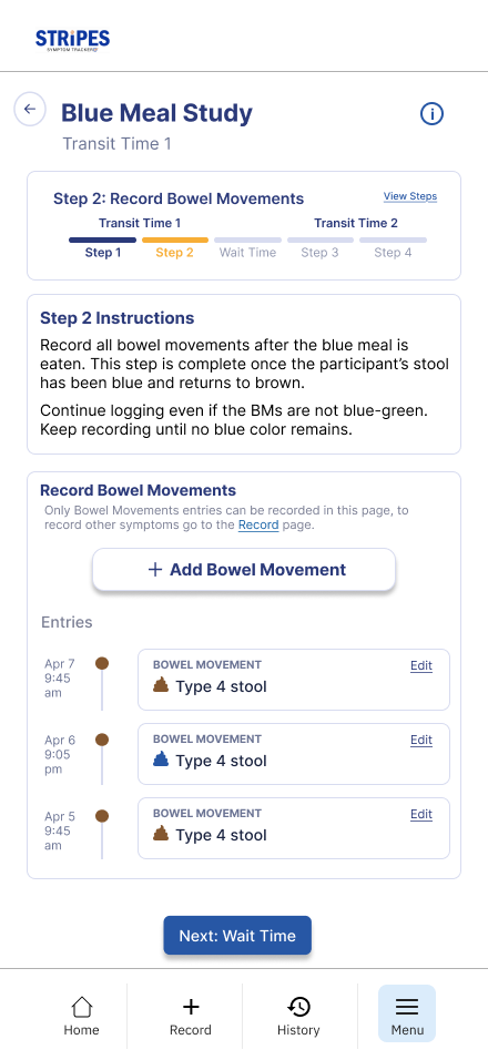
The Blue Meal Study workflow was redesigned to make study requirements easier to follow. Findings showed users struggled to locate study information, understand required phases, and move through tasks like Transit Time. The redesign focused on clearer study cards, step-by-step guidance, and visible progress cues.

Symptom logging

The logging experience was redesigned to reduce uncertainty during data entry. Clearer labels, grouped inputs, selected states, helper text, and confirmation feedback made recording symptoms feel more guided and less dependent on outside instruction.

History and review

The history flow was redesigned to make past entries easier to find and scan. This supported STRIPES as an ongoing tracking tool, not just a one-time study task — giving caregivers a way to review what was recorded and recognize patterns over time.

Before → after

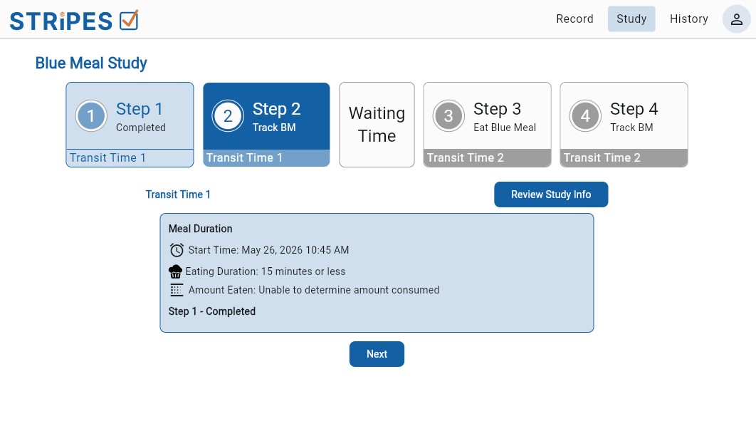
Before · STRIPES for web
STRIPES redesigned home screen
After · STRIPES for iPhone
10s
median time to log a day
day-7 return rate vs the old tracker
4.8
out of 5 prototype usability score

Why using both methods mattered

Cognitive Walkthrough helped identify system-level issues in the original experience, including unclear task logic, missing confirmations, unexpected redirects, incomplete task descriptions, and misleading flows.

Usability Testing showed how those issues affected real users. Participants hesitated, became confused by terminology, missed instructions, and sometimes interpreted STRIPES as a short-term or one-time-use tool rather than an ongoing health-tracking system.

Together, the two methods gave the redesign stronger direction. When the same issue appeared in both CW and UT, it became easier to prioritize. When each method revealed different issues, it showed why one method alone would not have captured the full caregiver experience.

Final takeaway

The redesign moved STRIPES from a desktop/web experience with unclear workflow moments into a more focused mobile direction built around caregiver needs.

Rather than simply making the interface cleaner, the redesign clarified where to start, how to complete study-related tasks, how to record symptoms, and how to review past information. In a caregiver health-tracking tool, those improvements matter because clearer workflows can support more complete, reliable, and trustworthy symptom data.

Redesign solution

Designed around how
people actually track.

The redesigns were developed to address the usability problems found during testing — and to improve how people move through the experience.

Our goal
Improve the flow Reduce confusion Match mental models Fit real-world behaviour
What the redesigns aimed to achieve
Clearer guided tracking

Record multiple symptoms through a simple step-by-step flow, instead of jumping between separate sections.

Diary-style daily entries

Capture what happened across the whole day in one record, like a diary entry.

More complete daily records

Add multiple symptoms, timing, context, and notes in one place so an entry feels complete.

Better fit with expectations

Clear instructions, easy review of past entries, and a simple way to see daily patterns.

Final design

The app, at a glance.

A look at the finished product — then a breakdown of each flow, the problem it solved and what changed.

STRIPES home screen
WEB APP
MOBILE
Mobile-first
redesign

"From desktop forms to a guided, tap-based caregiver workflow."

STRIPES redesign
STRIPES history week
Flow by flow

Five problems, five redesigns.

Onboarding

Turning a confusing setup into a clear, guided start.

Unclear where to start

Caregivers couldn't tell where the Blue Meal Study actually began.

Hidden setup steps

It wasn't clear what setup steps were required to get going.

No clear way through

Users struggled to tell how to move from one onboarding step to the next.

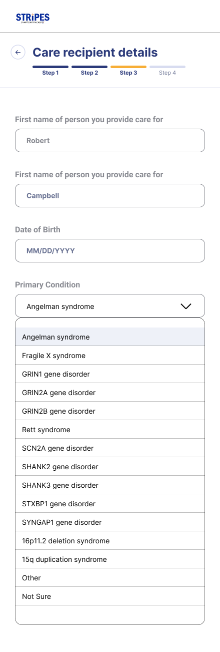
Rigid recipient setup

Care-recipient setup didn't fit situations that weren't clear-cut.

STRIPES welcome screen
Welcome
STRIPES care recipient details
Care recipient
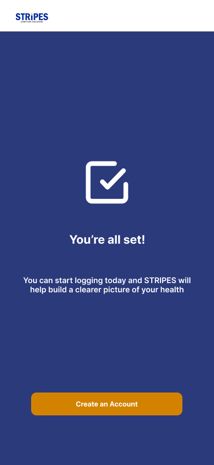
STRIPES all set
Ready
A clear Welcome screen

Onboarding opens with a Welcome screen that orients caregivers before setup begins.

Guided four-step flow

Setup is broken into four clear steps, so the next action is always obvious.

Visible progress

Progress indicators show how far along onboarding is and what's left.

Flexible recipient setup

Care-recipient setup adds Other and Not Sure options, with required Terms and Privacy confirmation.

Problem
  • Users could not tell where the Blue Meal Study started, what setup steps were required, or how to move through onboarding.
Solution
  • We redesigned onboarding as a guided four-step flow with a clear Welcome screen, visible progress indicators, required Terms and Privacy confirmation, and simpler care recipient setup with Other and Not Sure options.
Impact

The new onboarding flow gives caregivers a clearer starting point, reduces setup confusion, and helps users enter the study with more confidence and less reliance on moderator guidance.

Home screen

Turning the home screen into a clear starting point.

No homescreen in original desktop design
No clear starting point

Nothing signalled where to begin or what the most important next step was.

The study felt buried

Blue Meal Study sat apart from recording and read more like a pop-up than an active task.

Labels were too broad

Vague labels like “Record” left users unsure whether a section was for study info, resources, or symptom logging.

Dense and hard to scan

Tight spacing and weak hierarchy made the screen slow to read at a glance.

STRIPES home screen
A clear starting point

The moment caregivers open the app, they see where they are in the study and what to do next.

The study, front and center

Active Blue Meal Study status, the current day, and the next required step sit at the top — no searching required.

One tap to the right task

Logging symptoms, meals, and study steps are all reachable directly from the home screen.

Progress you can trust

Visible progress and completion cues confirm what's done and what still needs attention.

Problem
  • Users could not easily find Blue Meal Study information, understand where to begin, or identify the most important next step.
  • The original experience separated study information from recording tasks, which made the workflow feel disconnected.
  • Users were unsure whether they should go to Study, Record, Resources, or another area to complete their task.
  • The screens also felt dense and hard to scan quickly.
  • Labels like “Record” were too broad, causing some users to misunderstand whether the section was for study information, resources, or daily symptom tracking.
Solution
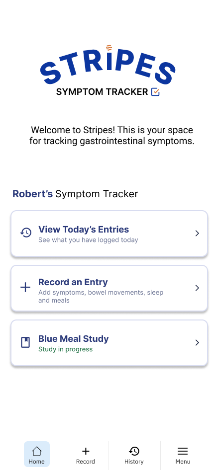
  • We redesigned the Home screen as the main orientation point for STRIPES.
  • The Blue Meal Study was placed directly on the Home screen as a clear card with visible study status, making it feel like an important active task instead of a pop-up or advertisement.
  • The Home screen also organizes the caregiver's main actions into three clear paths: Blue Meal Study, Record an Entry, and View Today's Entries.
  • These labels make the difference between study participation, symptom logging, and entry review easier to understand.
  • To improve scanning, the redesign uses simple cards, clear spacing, consistent icons, and stronger visual hierarchy so users can quickly recognize what each action is for.
Impact

The redesigned Home screen gives caregivers a clearer place to start and reduces confusion between study tasks and daily recording. By making the Blue Meal Study visible, showing its status, and using more specific action labels, the screen helps users understand what to do next without relying on moderator guidance.

This supports a smoother caregiver workflow: users can begin the study, record symptoms, and review today's entries from one central place.

Blue Meal Study

Turning a confusing study process into a guided step-by-step flow.

Study felt hidden

Key Blue Meal Study information lived in unexpected places like the Study tab or Terms of Service.

No sense of progress

Users couldn't tell what step they were on or what action was required next.

Confusing terminology

Terms like Motility, BMS, BM, Transit Time, and Wait Time went unexplained.

One rigid path

The flow only worked if followed exactly, and didn't match how caregivers track over time.

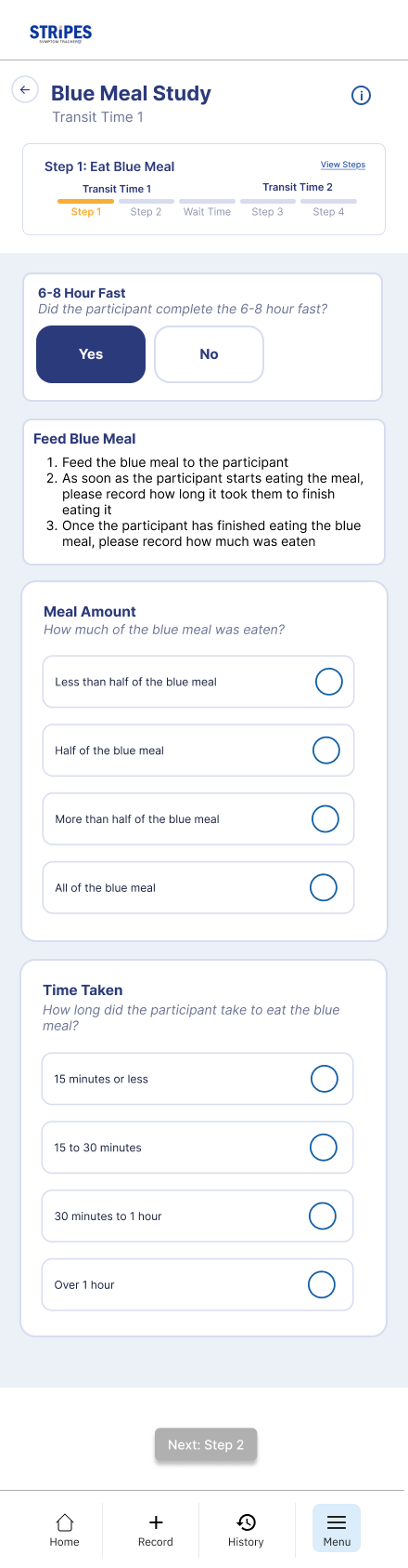
Blue Meal Study — Step 1: Eat Blue Meal
Step 1: Eat Blue Meal
Blue Meal Study — Step 2: Record Bowel Movements
Step 2: Record Bowel Movements
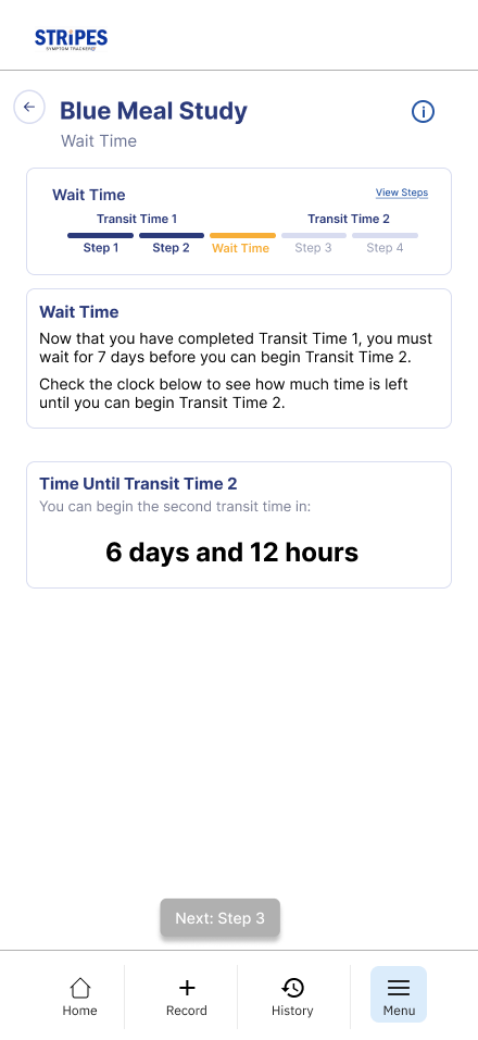
Blue Meal Study — Wait Time
Wait Time
Its own guided flow

A dedicated landing page with a clear Start Study action, reachable from the Home screen.

A persistent step bar

Named phases show where caregivers are and what comes next, each with a short explanation.

Plain-language terms

A Terms to Know section and a clear timeline, including the 7-day Wait Time, explain what and when to log.

Supportive forms

Inline questions, a Next button disabled until fields are complete, clear errors, and a fixed action button.

Problem
  • Users struggled to understand how to start and move through the Blue Meal Study.
  • Key information was placed in unexpected locations, such as the Study tab or Terms of Service, which made the study feel hidden instead of central to the experience.
  • Users also had trouble recognizing required actions, understanding study progress, and knowing what step they were currently on.
  • The workflow only worked well if users followed one exact path.
  • When users moved around the app, they became unsure where they were, what they had completed, and what they needed to do next.
  • Study terms such as Motility, BMS, BM, Transit Time, Wait Time, and Blue Meal also created confusion because they were technical, inconsistent, or not explained early enough.
  • The study flow also did not fully match how caregivers experience tracking over time.
  • Users were unsure when to log symptoms, whether the app was for one-time or daily use, how meals connected to symptoms, and how to handle ongoing or unusual situations.
Solution
  • We redesigned the Blue Meal Study as a dedicated guided flow that users can access directly from the Home screen.
  • Instead of burying BMS information inside Terms of Service or general study areas, the study now has its own clear landing page with a visible Start Study action.
  • The new flow uses a persistent step bar with named phases, so users can always see where they are in the study and what comes next.
  • Each phase includes short explanations for why the step matters, what the caregiver is tracking, and how the step connects to the overall study.
  • To reduce confusion, the redesign defines key terms upfront in a Terms to Know section using plain language.
  • The study also explains the tracking timeline clearly, including the 7-day Wait Time before Transit Time 2, so users understand when to log information and why timing matters.
  • The form experience was also made more supportive.
  • Each input includes an inline question, the Next button stays disabled until required fields are complete, and error messages explain what is missing.
  • Stronger visual hierarchy, grouped cards, a highlighted current step, and a fixed blue action button help users scan the screen and complete tasks more confidently.
Impact

The redesigned Blue Meal Study flow gives caregivers a clearer path from study introduction to study completion. Users can understand what the study is, where to start, what terms mean, what they are tracking, and how to move through each phase without relying on outside guidance.

By making progress visible, clarifying required actions, and explaining timing and terminology in plain language, the redesign reduces the risk of skipped steps, incomplete entries, and misunderstood study requirements. This supports a more reliable caregiver workflow and helps protect the quality of the symptom and study data collected through STRIPES.

Resources

Giving study information a clear home.

Hard to find help

Guidance was scattered across the Study tab, Terms of Service, and other areas.

Mixed with legal text

Study information sat alongside Terms of Service, so it didn't feel like help.

Unclear instructions

Users struggled with study steps and unusual or edge-case situations.

Unexplained terms

Medical terminology like the Bristol Stool Scale wasn't explained in plain language.

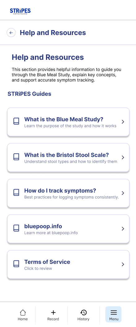
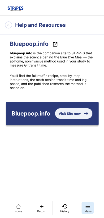
Resources home screen
Resources Home
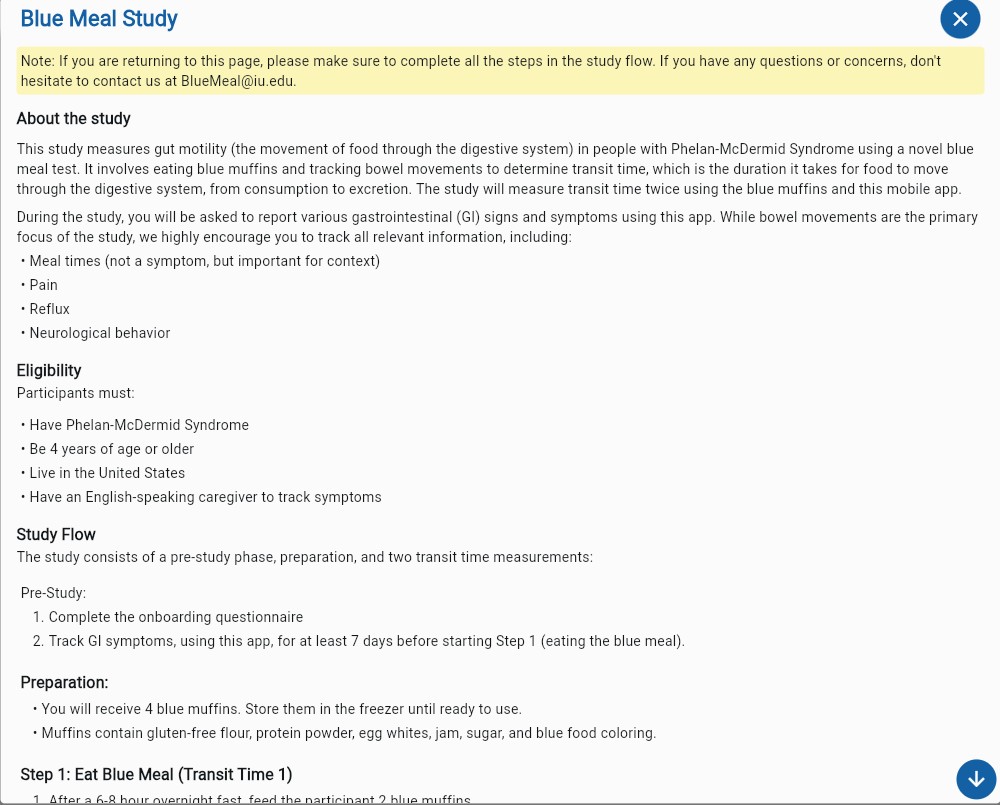
What is the Blue Meal Study?
Bluepoop.info resource page
Bluepoop.info
A dedicated support hub

Resources became one clear home for all study guidance.

Separated from legal text

Blue Meal Study information was pulled out of Terms of Service into its own place.

Guide-style pages

Pages explain what the study is and how it works, plus a How to Log Different Situations page for unclear cases.

Plain-language scales

A Bristol Stool Scale page explains stool types in plain language with visual support.

Problem
  • Users could not easily find or understand key Blue Meal Study information.
  • Important guidance was scattered across areas like the Study tab or Terms of Service, which made it hard for caregivers to know where to look when they needed help.
  • Users also struggled with study instructions, edge cases, and medical terminology such as the Bristol Stool Scale.
Solution
  • We redesigned Resources as a dedicated support hub for study guidance.
  • Blue Meal Study information was separated from Terms of Service and placed in one clear location.
  • We also added guide-style pages that explain what the study is, how it works, and what actions users need to take.
  • To support real tracking situations, Resources includes a "How to Log Different Situations" page with examples for unusual or unclear cases.
  • A Bristol Stool Scale resource page explains stool types in plain language with visual support.
Impact

The Resources redesign makes study information easier to find, understand, and return to when caregivers need help. By separating educational content from legal content, clarifying study steps, and explaining medical terms in a more approachable way, the design reduces confusion and supports more accurate symptom logging. This gives caregivers more confidence while moving through the study and helps protect the quality of the data they record.

Symptom Logging

Making symptom entry more flexible, guided, and connected to the study.

Disconnected from the study

Logging didn't make clear when Blue Meal Study information mattered.

Too rigid for real life

No way to say None, Not Sure, Other, or that the exact time was unknown.

Repetitive entry

Each symptom type meant a separate screen, even when several happened together.

Unclear labels and scales

Terms like BM and GI Symptoms, and the pain and stool scales, went unexplained.

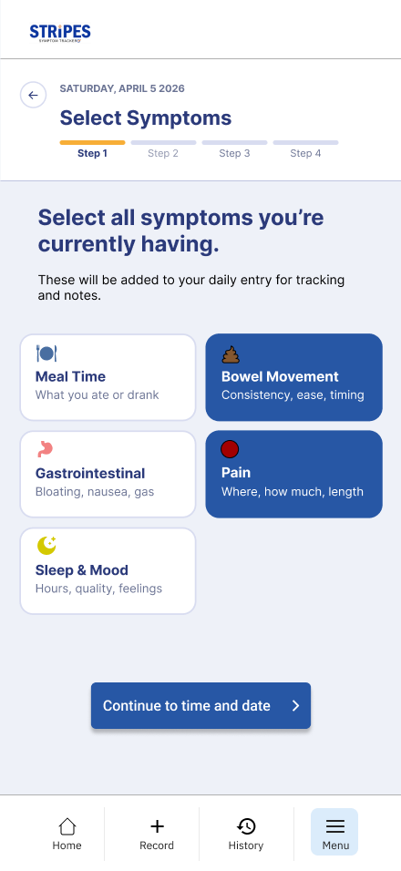
Select symptoms screen
Select symptoms
Pain details entry
Add details
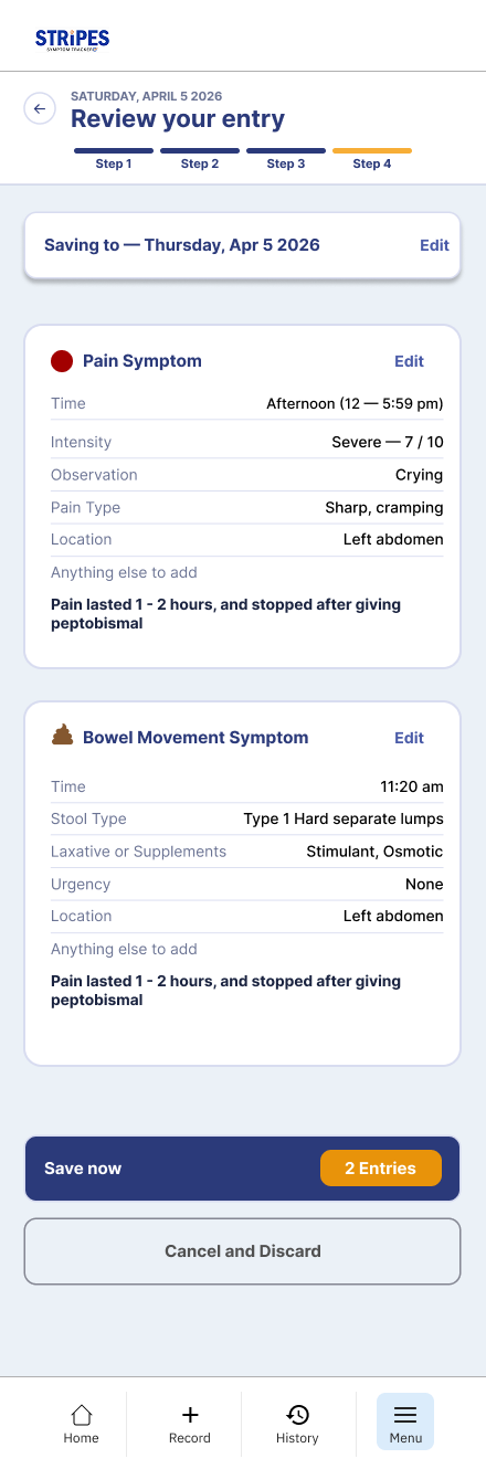
Review your entry
Review entry
Guided step-by-step flow

A 4-step progress bar, a persistent date header, and clear prompts show what to do next.

Study cues in context

BMS guidance lives inside the Bowel Movement flow, asking about blue dye exactly when it matters.

Built for real situations

None, Other, and Not Sure options, flexible date and time, and a body diagram for pain location.

Clearer labels, less repetition

Plain terms and grouped scales, plus picking multiple symptoms at once with one shared time.

Problem
  • Users had trouble understanding how symptom logging connected to the Blue Meal Study.
  • Study guidance was often separated from the moment users needed it, so caregivers did not always know when BMS information mattered during recording.
  • The symptom flow also felt too rigid for real caregiver situations.
  • Users needed ways to say they had no symptoms, were unsure, had something outside the preset options, or did not know the exact time something happened.
  • Logging also felt repetitive because users had to move through separate screens for each symptom type, even when multiple symptoms happened around the same time.
  • Users were also confused by unclear inputs, technical labels, and scales.
  • Terms like BM and GI Symptoms were not always understood, and pain or stool scales did not always explain what the numbers or categories meant.
  • Before saving, users were not always sure whether they could edit an entry or revise information.
Solution
  • We redesigned symptom logging as a clearer, more flexible step-by-step flow.
  • A 4-step progress bar and persistent date header help users understand where they are in the recording process.
  • Clear prompts, selected states, placeholder text, and action buttons explain what to do and what comes next.
  • To connect logging to the Blue Meal Study, BMS guidance appears directly inside the Bowel Movement flow.
  • When a caregiver is participating in BMS, the Bowel Movement screen asks whether the bowel movement contained blue dye, making the study relevant at the exact moment it needs to be recorded.
  • The flow also supports more real-life symptom situations.
  • Users can choose options like None, Something Else / Other, and Not Sure.
  • Free-text fields, flexible date and time options, duration questions, and visual tools like a body diagram for pain location help caregivers describe symptoms more accurately.
  • To reduce repetition, users can select multiple symptom types in one place before entering details.
  • A Set time for all symptoms option lets users apply one time across related symptoms instead of repeating the same input again and again.
  • Scales and labels were also simplified.
  • BM was replaced with Bowel Movement, GI Symptoms was paired with Gastrointestinal Symptoms, pain ratings were grouped into labeled ranges like Mild, Moderate, and Severe, and the Bristol Stool Scale was organized into clearer categories such as Constipation, Normal Range, and Diarrhea, with Not Sure available when needed.
  • The Review screen includes visible Edit links, plus Cancel and Discard options, so users understand they can revise information before submitting.
Impact

The redesigned symptom logging flow helps caregivers record health information in a way that better matches real life. It reduces confusion by using clearer terms, guided questions, flexible timing, visible progress, and stronger input support.

By connecting BMS guidance directly to the Bowel Movement flow, the design helps users understand when study-specific information matters. By allowing uncertainty, edge cases, and edits, the flow supports more accurate and complete entries instead of forcing caregivers into choices that may not fit the situation.

Overall, symptom logging becomes less repetitive, easier to follow, and more trustworthy as a data-entry experience.

History

Making past entries easier to find, scan, and understand over time.

Hard to find

History wasn't visible enough, and finding a specific past entry was difficult.

Overwhelming to scan

Once opened, too much information appeared at once, making the screen hard to read.

Entries felt disconnected

Meals, bowel movements, pain, sleep, mood, and GI symptoms read as separate records, not related events.

Unsure if editable

Users didn't know whether a saved entry could still be changed.

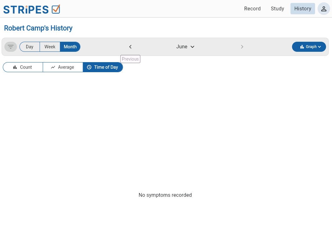
History month view
Month view
History week view
Week view
Its own History tab

A dedicated review space in persistent bottom navigation: Home, Record, History, and Menu.

Filters and calendar views

Entry-type filters, date navigation, and week/month views with dots marking days that have entries.

Grouped by timeline

Related entries sit together in clean, timestamped cards with color-coded dots, grouped into sections like Midday.

Clear edit access

Each entry card has a visible Edit link, plus a prominent + New Entry button.

Problem
  • Users had trouble finding specific past entries, understanding how symptoms connected over time, and knowing whether they could edit information after it was saved.
  • History was not visible enough in the app structure, and once users found it, the screen was hard to scan because too much information appeared at once.
  • The original experience also made logged information feel disconnected.
  • Meals, bowel movements, pain, sleep, mood, and gastrointestinal symptoms could feel like separate records instead of related events happening across the same day.
  • This made it harder for caregivers to review patterns, connect symptoms to timing, or understand what had already been recorded.
Solution
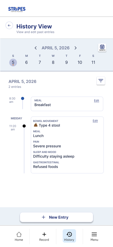
  • We redesigned History as a dedicated review space with its own tab in the bottom navigation.
  • Persistent navigation gives users clear access to Home, Record, History, and Menu, making it easier to understand where they are and move between key areas of the app.
  • To make past data easier to find, the History screen includes entry-type filters, date navigation, and week/month calendar views.
  • Dot indicators show which days have entries, helping users scan for logged activity quickly.
  • Entries are grouped chronologically into timeline sections, such as Midday, so caregivers can see how different logs connect across the day.
  • Related entries, including meals, bowel movements, pain, sleep and mood, and gastrointestinal symptoms, appear together in clean cards with clear timestamps and color-coded dots for entry type.
  • Each entry card includes a visible Edit link, making it clear that past entries can be changed.
  • A prominent + New Entry button stays easy to find for users who need to add another log from the History view.
Impact

The redesigned History flow helps caregivers move from simply storing entries to actually reviewing and making sense of them. Filters, calendar views, timeline groupings, and clearer entry cards make past data easier to find, scan, and edit.

By showing related symptoms and events together over time, History better supports pattern recognition. This helps caregivers understand what changed, check for missing or incorrect information, and maintain more complete and reliable symptom records.

Research

Evaluating the original
STRIPES experience.

Before redesigning STRIPES, we evaluated the existing web app to understand where the caregiver workflow was breaking down — not to validate the redesign, but to define what needed to change.

01

Goals

The research focused on how well the original STRIPES experience supported caregivers during key study and symptom-tracking tasks. Three questions framed the evaluation:

  • Where did users hesitate, get confused, or take the wrong path?

    We wanted to find the moments where users could not move forward confidently without help.

  • Which parts of the workflow created the most friction?

    We looked for breakdowns in navigation, study flow, terminology, data entry, and feedback.

  • Which issues could affect the quality of symptom data?

    STRIPES depends on accurate entries over time, so we focused on problems that could cause skipped steps, incomplete entries, or misunderstood instructions.

02

Methods

We used two evaluation methods on the original STRIPES experience: Cognitive Walkthrough and moderated Usability Testing.

  • Cognitive Walkthrough

    Evaluated whether users would know what to do at each step, understand the available actions, and get enough feedback to continue.

  • Usability Testing

    Showed how real participants interpreted the app, where they hesitated, and which tasks they could complete independently.

2
evaluation methods
3
Cognitive Walkthrough evaluators
7
Usability Testing participants
6
core tasks tested
17
usability issues catalogued
03

Current-state evaluation

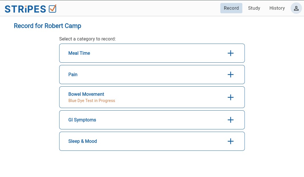
The original STRIPES app was evaluated across core caregiver tasks: finding Blue Meal Study information, starting the study, recording bowel movements, progressing through study steps, and reviewing or editing entries. The main problems were not only visual — they were structural. Users struggled to understand where the study began, how study tasks connected to symptom recording, what certain terms meant, and whether actions had been completed.

  • Finding BMS study information

    Users had trouble locating key study details because BMS information was not placed where they expected it.

  • Starting the Blue Meal Study

    Users did not always know how to begin the study or what steps were required before recording.

  • Completing Transit Time steps

    Users struggled with timing, wait periods, progress, and required study actions.

  • Reviewing or editing past entries

    Users had difficulty finding history, understanding previous logs, and recognizing whether entries could be edited.
04

Synthesis

After testing, we organized issues by frequency, severity, and overlap between methods. When the same issue appeared in both Cognitive Walkthrough and Usability Testing, it became a stronger redesign priority. The findings were synthesized into five root causes:

  • Start & discoverability

    Users did not know where to begin or where key study information could be found.

  • Study vs. Record split

    The product separated study information from recording tasks, but users expected one guided flow.

  • Guidance & terminology

    Medical terms, shorthand labels, missing onboarding, and unclear explanations made the app harder to understand.

  • Inputs & symptom fit

    Some forms, scales, and symptom options did not fully support real caregiver situations, uncertainty, or edge cases.

  • Visibility & trust

    Important actions, confirmations, progress cues, and edit options were not always visible enough to help users feel confident.

05

Prioritization

The evaluation uncovered more issues than we could address at once, so we prioritized the problems that most affected task completion, caregiver confidence, and data quality.

SWEET SPOT Effort → Impact → Now Next Later
  • Now
    Clarify the core flows

    The starting point, Blue Meal Study flow, symptom logging, Resources, and History.

  • Next
    Strengthen guidance

    Terminology, edge-case support, study education, input guidance, and progress feedback.

  • Later
    Deeper tracking

    Richer reporting, long-term visualizations, and advanced tracking support.

06

What we measured

Because this research evaluated the original experience, the measurements helped us understand the baseline problems before redesign.

73.1
SUS score — generally good perceived usability
  • Task completion

    Could users complete key STRIPES tasks without moderator guidance?

  • Observed friction

    Where did users pause, misunderstand instructions, or take the wrong path?

  • Issue frequency and severity

    Which problems appeared most often, and which had the greatest impact on task success?

  • Method overlap

    Which issues appeared in both Cognitive Walkthrough and Usability Testing?

  • Perceived usability

    The original prototype scored 73.1 on the SUS — generally good, though task performance showed several moments still needed stronger guidance.

07

Key insights

STRIPES didn’t need a visual refresh — it needed a clearer caregiver workflow.

  • Users needed a clearer starting point.

    The Blue Meal Study was not visible enough, and users did not always know where to begin.

  • Study and recording felt disconnected.

    Users expected one guided flow, but STRIPES separated study information from symptom entry.

  • Instructions needed to appear at the moment of action.

    Users needed guidance while logging, not only in separate study or resource areas.

  • Terminology created unnecessary friction.

    Labels like BMS, BM, GI Symptoms, Transit Time, and Wait Time needed clearer plain-language support.

  • History needed to support review, not just storage.

    Caregivers needed an easier way to find, scan, edit, and understand past entries over time.

The research gave a clear redesign direction: make STRIPES easier to start, easier to follow, easier to log in, and easier to review later.

Built for mobile

Sleek, fast, made to tap.

Every screen designed for a quick check-in — and out.

STRIPES symptom logging screen
15s
to log a BM or symptom
STRIPES history screen
🩺
STRIPES
2.1×
faster than paper logging
Quick check-ins for busy caregivers

Log a BM, meal, or symptom in seconds.

Guidance in the moment
History built for review
Reflection

What I'd carry
forward.

Senso was a self-directed redesign concept — here's what held up, and where I'd push it further.

What worked

Shrinking the daily ask

Cutting logging to a single tap did more for consistency than any motivational feature.

What I'd change

Test the risky part sooner

The adaptive plan was the biggest assumption — I'd validate it in week one next time, not week three.

What's next

Proof beyond the prototype

A longer real-world trial, plus the streak-with-a-friend mode testers kept asking for.

Thanks for reading.