 ❤
❤Small steps,
stronger connections
A gentle, game-like way for couples to talk through money, values & the future — before saying “I do.”
An end-to-end product design project — research, UX, UI & game design, led solo.
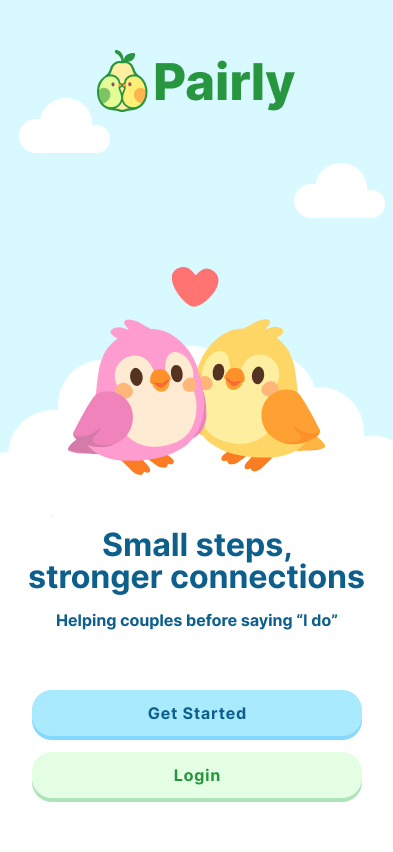

Helping couples have the conversations that matter.
Pairly is a gentle, game-like mobile app that helps couples have the conversations that matter — about money, values, and the future — before getting engaged. I led it end to end, from generative research and concept through UX, UI, and a tested, interactive prototype.
Communication breakdowns are the #1 cause of relationship failure.
- 1
Couples don’t know which conversations to have.
- 2
Partners struggle to start difficult but important discussions.
- 3
Existing solutions feel too clinical and intimidating.
Turn the talks couples dread into a ritual they enjoy.
Rather than cold worksheets or intimidating therapy, Pairly reframes relationship prep as a warm, game-like experience — small, private reflections that partners reveal together, building the habit of talking before problems take root.
Clinical · intimidating · avoided
Gentle · playful · done together
Project goals
Help couples discover which conversations to have — and when.
Break hard topics into small, low-pressure, winnable steps.
Answer privately, then reveal what you share — no judgment.
Use gentle, game-like delight so couples keep coming back.
Select a module, do the activity, compare results.
A simple loop couples come back to — pick a topic together, reflect on your own, then meet in the middle to see where you align and where you differ.



 Home
Home Modules
 Profile
 Chat
Chat

Select a module, do the activity, compare results.
A simple loop couples come back to — pick a topic together, reflect on your own, then meet in the middle to see where you align and where you differ.
Inside a module: prompts, reflections, and shared moments.
Each module unfolds as a short series of activities — quick prompts and reflections you can do on your own, then bring back together.
Turning emotional risk into small, safe product moments.
Research kept pointing at one thing: couples don't avoid money, values, and future talks because they don't care — they avoid them because the timing, the pressure, and the fear it will backfire feel too high. So the design problem was never “get couples to talk more.” It was lower the cost of starting — and every decision below traces back to that.
Design principles
The rules every screen had to pass.
Partners answer honestly before they compare.
Warm and human, never therapy homework.
Hard conversations broken into small, doable steps.
Results are conversation starters, not compatibility scores.
Pause, warm up, or come back later — anytime.
Answer privately. Reveal together.
Pairly suggests a small theme — saving, family, support — sized for one cup of coffee.
Each partner taps through prompts privately. No peeking, no pressure.
Side-by-side answers, with shared alignment highlighted and gentle nudges where you differ.
From the tested prototype — three taps from topic to talk:
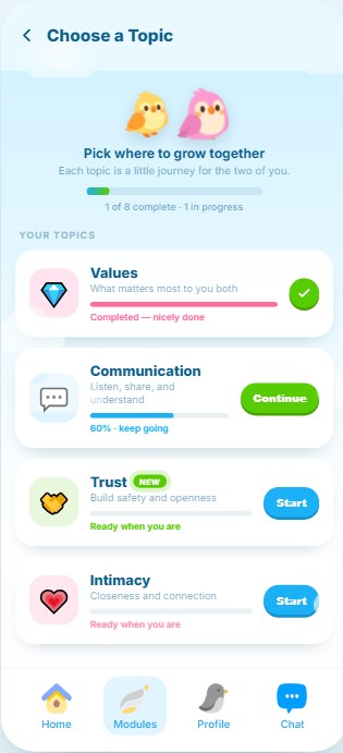
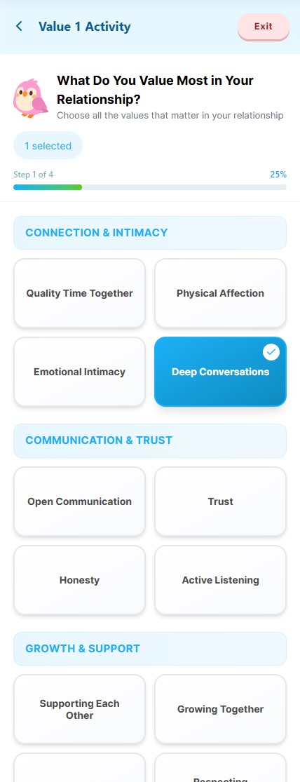

Why this ordering matters
Answering alone removes performance pressure, so each answer is honest. Revealing together then turns two honest answers into a shared starting point — not a live negotiation where someone has to back down. That single ordering is what makes disagreement feel safe instead of like failure.
Built Around the Research
I scoped the MVP around the behaviors my research showed were most fragile: emotional timing, private honesty, anxiety around comparison, and the need for small, guided conversations.
The first version of Pairly focused on proving the core ritual: check readiness, reflect privately, reveal together, and turn differences into conversation starters instead of conflict.
Intentional and private — not public or performative.
Prove the core loop on one topic before scaling.
Timing and emotional readiness came up in every interview.
Private responses unlock more honest answers.
Some couples prefer to process side-by-side.
Make difference feel safe, not exposing.
Turn gaps into a conversation, not a verdict.
An off-ramp when emotions feel too high.
Warm mascots keep it from feeling clinical.
Difference isn't failure — scores invite judgment.
Prove one ritual deeply before adding many shallowly.
Guide couples back to each other, not another inbox.
Pressure was already a barrier — no guilt nudges.
Pairly isn't therapy or diagnosis.
Intimacy shouldn't feel performative.
The real issue was values and trust, not tracking.
Validate the basic ritual first.
Pairly did not need to solve every relationship problem in v1. It needed to prove that the first step into a difficult conversation could feel safe, private, and doable.
Product structure
Six surfaces, one loop.
Link with your partner and set expectations.
Partner status, current module, next activity, gentle progress.
Money, values, chores, family, the future.
Answer privately, with no pressure to perform.
Compare gently, one topic at a time.
Pause, warm up, or come back later.
Core user flow
The happy path, end to end.
- 1Open Pairly
A warm landing screen and a single Get Started.
- 2Pair with your partner
Share an invite code; set the expectation — answer honestly, just for you.
- 3Pick a module
From Home, choose a small topic to start with.
- 4Readiness Weather
A quick how are you arriving? check before anything deeper.
- 5Answer privately (Solo Mode)
Tap through prompts on your own. No peeking.
- 6Wait for your partner
They finish in their own time — no countdown, no nudging.
- 7Gentle Reveal
Answers side by side: alignment highlighted, differences framed as talk about.
- 8Start talking
One gentle prompt hands the conversation back to the couple.
- 9Loop or exit
Pick another topic — or step out through Comfort Mode anytime.
Key product states
Designing past the happy path. The happy path is easy. Safety lives in the edge states.
A calm "they're still reflecting" screen with a bird companion.
No countdown. No nudge to rush them.
A warm, quiet highlight.
Celebrated softly — never gamified into a "win".
Framed as "talk about," with a starter prompt.
No red, no error language, no score.
One-tap Comfort Mode.
Pauses the activity, saves progress, suggests a breather.
"Bob's still reflecting — no rush."
Removes blame and pressure from both sides.
A gentle warm-up, not a guilt screen.
Streaks never punish time away.
Undo before a reveal becomes permanent.
Restores control at the most vulnerable moment.
A brand, a mascot, and a mechanic that makes alignment feel safe.
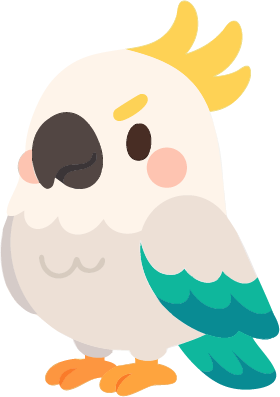
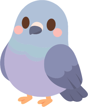
Love Birds
Pairly’s identity has two faces — a warm logotype and a pair of birds — working together to make hard talks feel light.
Soft, sunny, safe.
Warm pastels keep tough topics feeling approachable. Coral lives only in moments of warmth and action — never warning.
Rounded, warm, and easy to read.
Warm, encouraging — never clinical.
“You two are aligned!”
We say“Match score: 80%”
We avoid“Nice start — want to try one small topic today?”
We say“You failed to agree.”
We avoid“You see this differently — and that’s okay.”
We say“Conflict detected.”
We avoidFriendly and legible for everyone.
Navy ink on light backgrounds clears WCAG AA.
Coral always pairs with an icon or label.
Green/coral stays distinguishable.
Thumb-sized taps with visible focus states.
Emotional support system — a cast of 10
Testers asked for more variety and warmth, so the cast grew to ten. Each one shows up at a specific moment, so a friendly face delivers the hard parts instead of a cold interface.







What worked, what stung, what shipped to v2.
- The mascot made hard prompts feel safe — “like a friend asking.”
- Accept / Pass / Split decisions turned values into a game couples enjoyed.
- The reveal screen surfaced invisible labor without anyone having to name it first.
- Choosing in front of a partner still felt judged — needs stronger privacy framing.
- People wanted an undo on every reveal step before it became permanent.
- One mini-game felt too light for the topic — tone needs to scale with weight.
A warmer way in — and a clear path forward.
Pairly landed on a tested prototype couples described as “the first time talking about money felt like a date, not a fight.”
What I’d measure next
Targets, not measured results.
Next, I’d harden the privacy model, retune mini-game tone by topic weight, and run a four-week diary study to see whether the ritual sticks in real relationships.
The biggest lesson was tonal: in this space, gentleness isn’t decoration — it’s the product. Every interaction either earns trust or burns it, and the system has to carry that weight on every screen.
What worked, what surprised us, and what we’re shipping next.
After putting the prototype in front of real couples, three patterns stood out. Each one shaped what Pairly became — and what still needs to land in the next release.
Couples opened up far more once they knew answers stayed solo until both were ready to reveal.
Next step · Keep the private-first flow as the core promise.Love Birds softened heavy prompts; participants described the tone as “a friend, not a form.”
Next step · Lean into mascot moments at every emotional peak.When answers diverged, couples wanted a way to pause, breathe, and revisit — not a forced reaction.
Next step · Ship an undo + “talk later” option on every reveal.