UX/UI Case Study · 2025

Temikki
AR Journaling

Redesigning AR interactions to create a more engaging and comforting experience for hospitalized children tracking their emotional wellbeing.
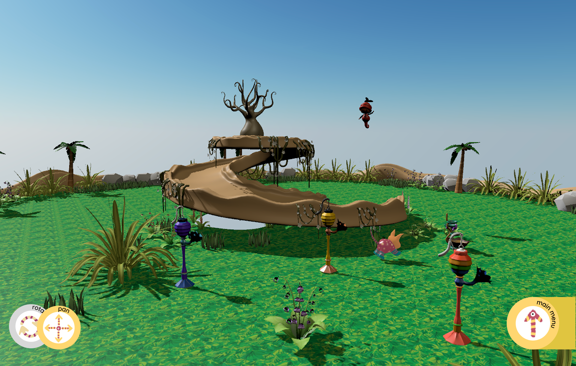
Temikki AR app interface

Overview

A tablet-based AR companion for pediatric hospital wards, where children journal their feelings through a magical garden that grows alongside their daily emotional check-ins.

Role
Lead UX/UI Designer
Focus
UX, Interaction Design, 3D Modeling
Timeline
12 weeks
Tools
Figma, ARKit, Blender
Scroll to explore

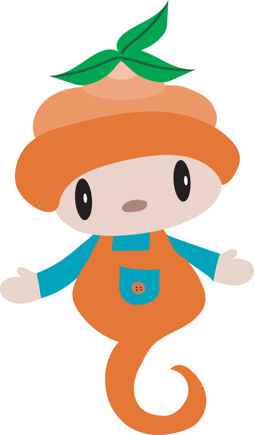
Designing with Custom 3D Assets

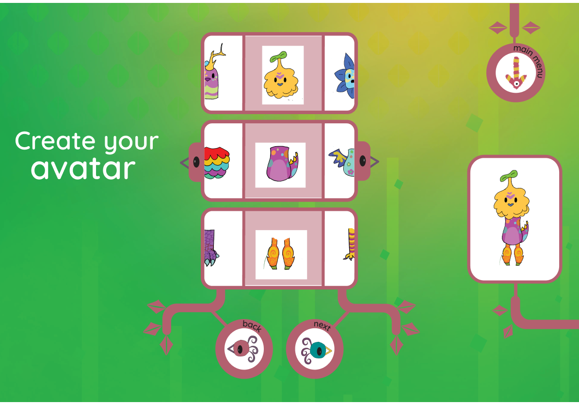
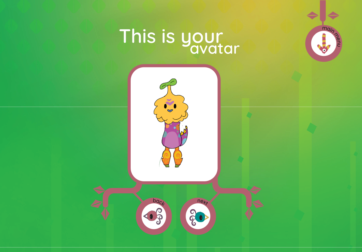
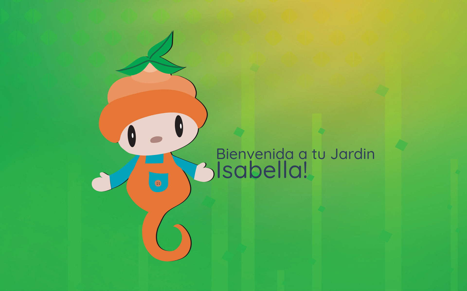
To create a more playful and engaging experience for young users, I modeled and animated a custom set of 3D characters and decorative objects using Maya. These assets helped establish a friendly visual language while making interactions more intuitive and memorable.

Why 3D Assets Work for Children

🎨

Visual Appeal

Friendly, rounded characters create an approachable, non-threatening environment for children in stressful situations

Enhanced Engagement

Interactive 3D elements encourage exploration and make emotional tracking feel like play rather than a medical task

🚀

AR Performance

Low-poly modeling techniques keep file sizes under 500KB while maintaining visual charm and detail

The Problem

Children in pediatric wards were giving up before they could log a single entry. Despite its innovative AR concept, Temikki's original interface was overwhelming young hospital patients during the moments that mattered most.

After conducting QA testing with children ages 6–10 and a cognitive walkthrough evaluation, three usability issues kept surfacing.

Original Temikki interface

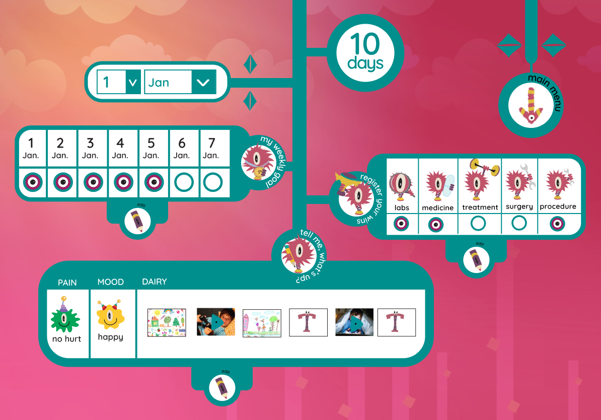
Cluttered onboarding flow — 7 steps before children could start playing

▶ Temikki's Story

Key Usability Issues

Complex Navigation

Children struggled to find activities quickly with critical functions buried 3-4 levels deep

Inconsistent UI Patterns

Confusing button placement and conflicting interaction patterns across different screens

Overwhelming AR Controls

Complex multi-step AR interactions frustrated children who needed simple, comforting experiences

My Goal

Reduce cognitive load so children can journal independently in a hospital setting — without needing an adult to guide them, and without the interface ever feeling like a clinical task.

Research & Insights

My research methodology combined QA testing, user testing sessions, and a cognitive walkthrough evaluation to identify critical usability barriers and inform design decisions.

Key Findings from QA Testing

1

Visual Hierarchy Drives Comprehension

Users demonstrated significantly higher task completion rates with visual feedback systems versus text-heavy interfaces

2

Cognitive Load Impacts Engagement

Users in high-stress environments require streamlined interfaces that minimize decision fatigue and reduce overwhelm

3

Gamification Increases Retention

Users showed 3x higher session frequency when emotional tracking was integrated with playful interaction patterns

Information Architecture Analysis

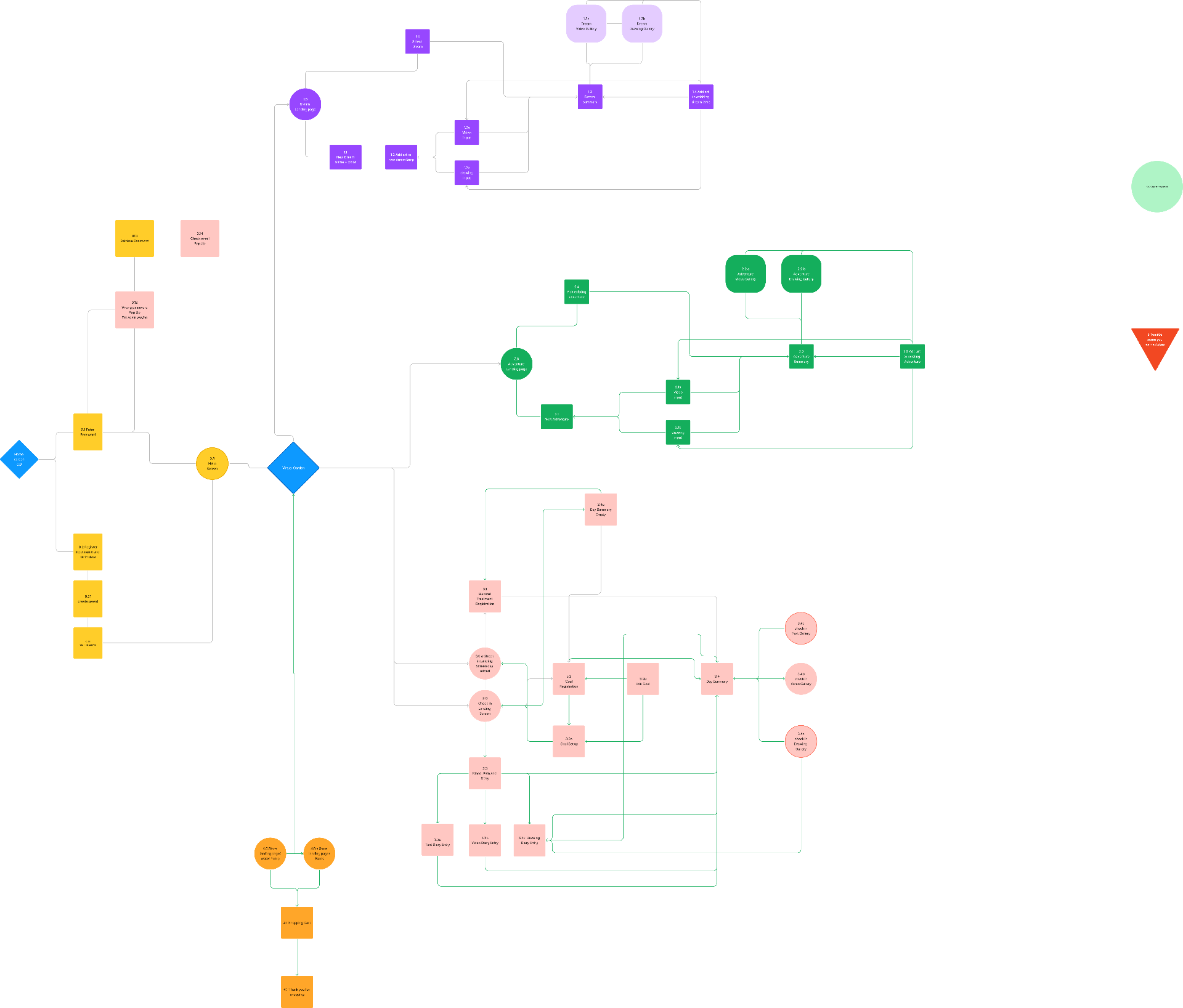
I created a comprehensive sitemap to visualize the user journey and identify structural pain points.

Original Temikki sitemap
Simplified VersionReduced navigation levels by 40%

Redesigned Information Architecture

After analyzing pain points, I created a new simplified sitemap that flattened the hierarchy, promoted frequently-used features to top-level navigation, and eliminated redundant menu screens.

!
Design Constraint

The Home menu had to be the AR island interface. This constraint required creative solutions to surface other critical features without disrupting the core AR experience.

Temikki App icon
Temikki App
Home
Dashboard
Dreams
Drawing Journal
Medical Journal
Health Tracking
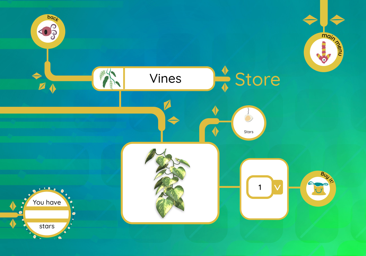
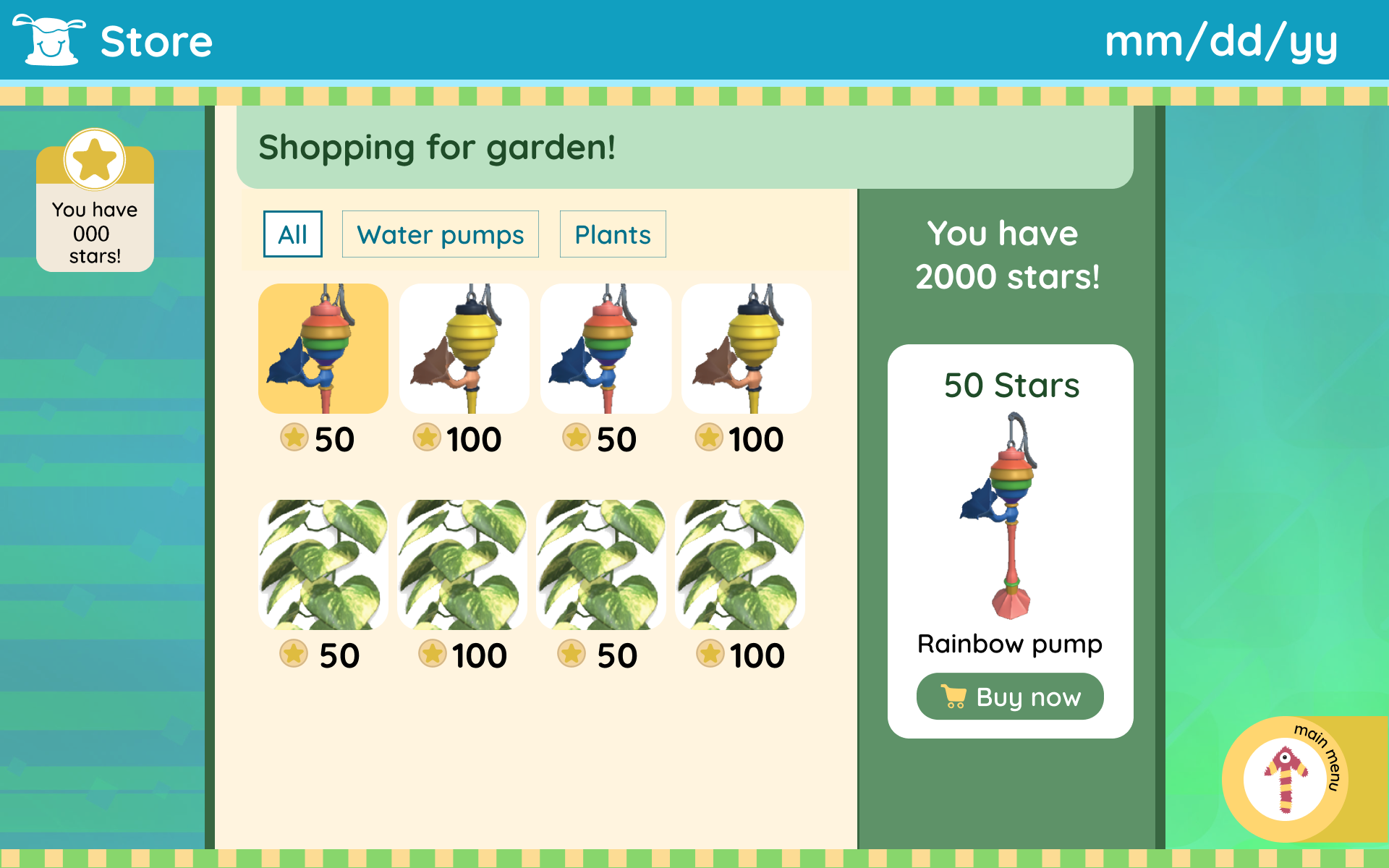
Store
Shop Items
AR Garden
Direct Access
HOME WIDGETS
AR Garden Preview
Current state & time
Plants Status
What's planted
Animal Visitors
Current count
DREAMS SUB-PAGES
Therapist Prompts
Guided drawing
View All Drawings
Journal history
Drawing Stats
Mental health tracking
MEDICAL SUB-PAGES
Pain Tracking
Log & visualize
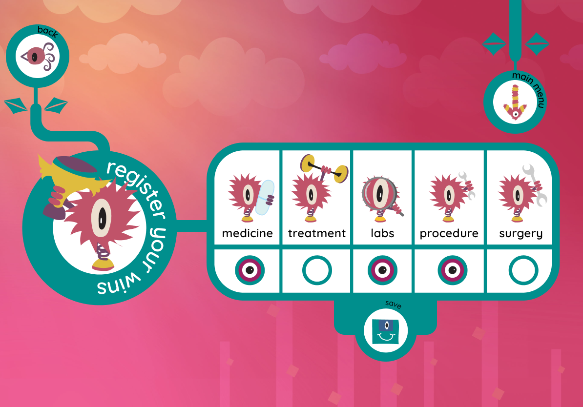
Mood Tracking
Daily emotional state
Treatment Log
Medications & therapy
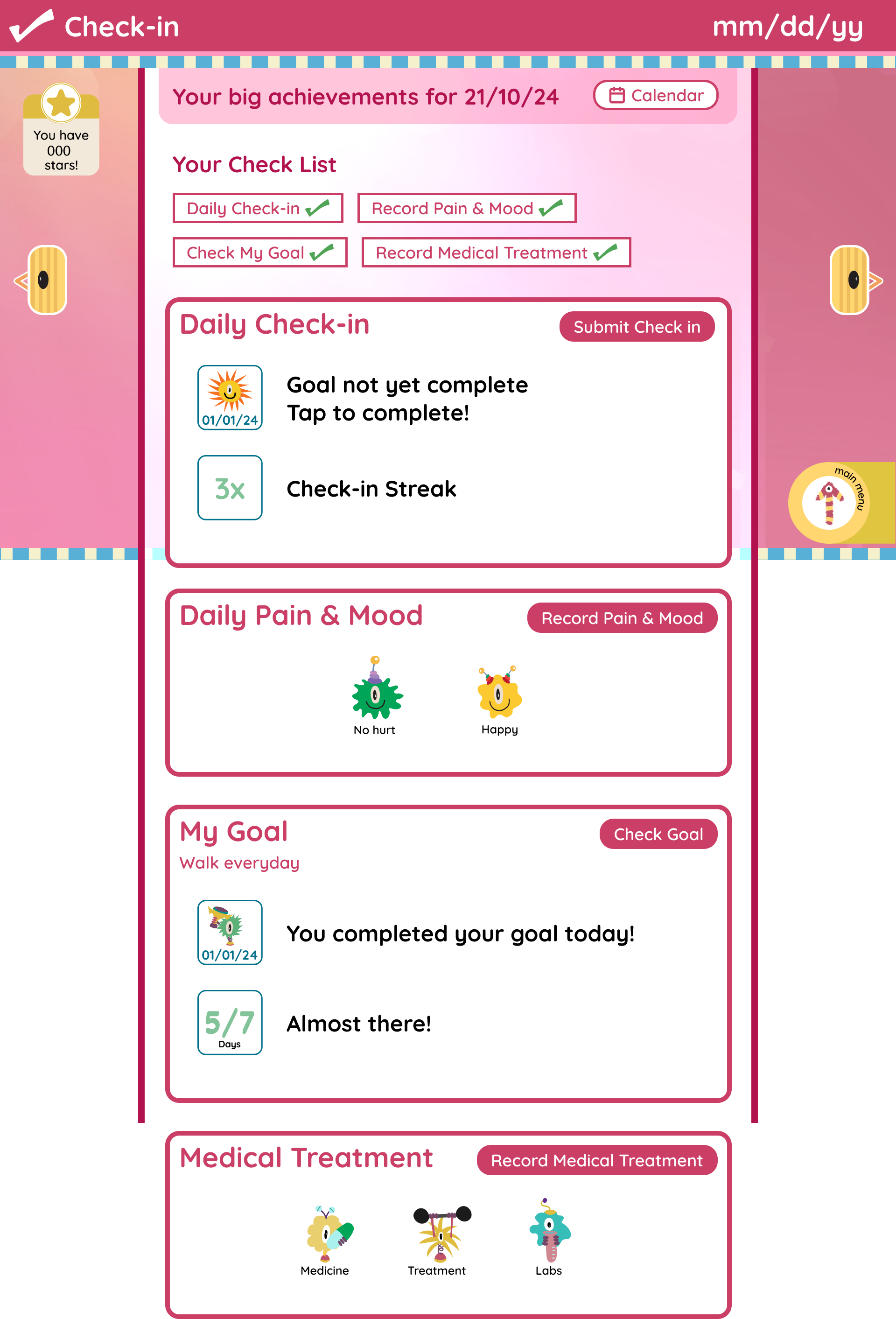
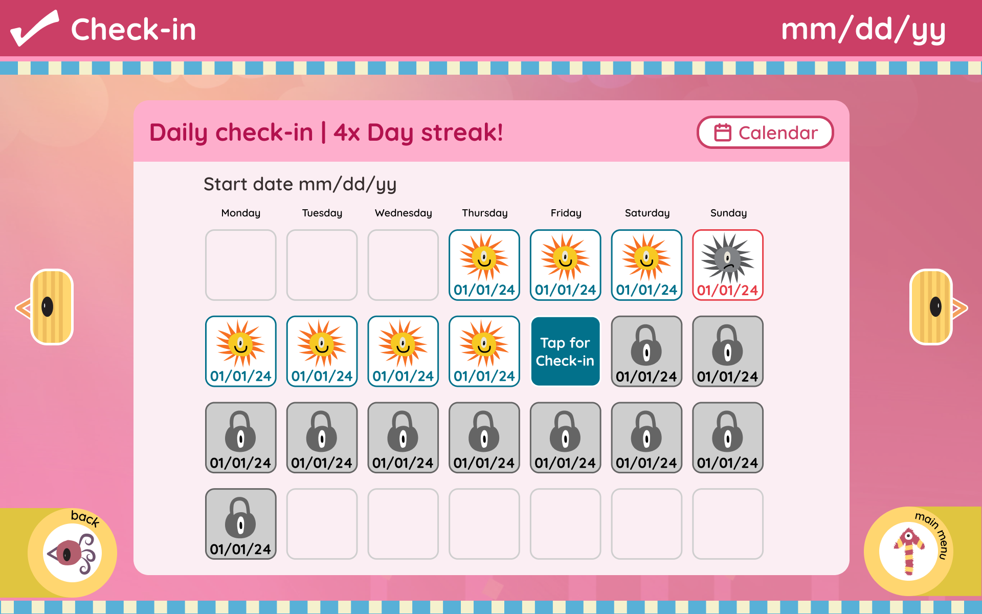
Daily Check-in
Small goals & progress
STORE SUB-PAGES
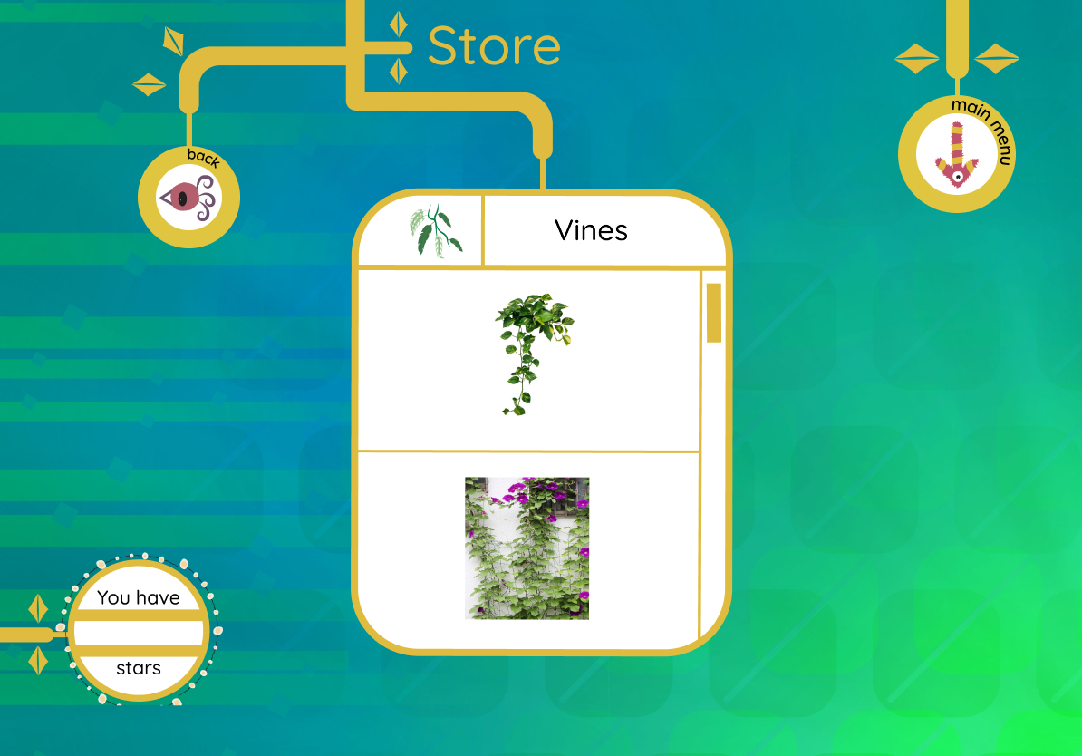
Plants & Seeds
Shop new species
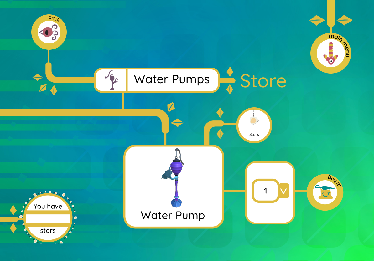
Water Pumps
Upgrade equipment
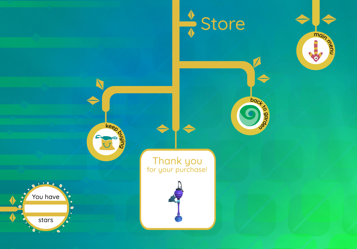
Shopping Cart
Checkout & purchase
AR GARDEN FEATURES
Island View
Day & night mode
Attract Animals
View visitors
Decorate Garden
Place plants & pumps
Reduced Depth
From 4 levels to max 2 levels
Promoted Features
AR Garden now top-level navigation
Quick Actions
Persistent FAB for critical tasks

Strategic Design Objectives

1

Optimize Information Architecture

Restructure navigation hierarchy to reduce interaction cost from 3-4 levels to ≤2 taps, decreasing time-to-task and improving discoverability

2

Drive Sustained Engagement

Leverage behavioral design principles and gamification mechanics to increase session frequency and reduce abandonment rates

3

Establish Scalable Design Systems

Implement reusable component patterns and interaction models to ensure consistency and reduce development friction

4

Design for Emotional Resilience

Apply trauma-informed design principles to create supportive experiences that mitigate stress in clinical environments

Design Strategy

I approached the redesign by focusing on four key strategies to transform the AR experience:

1

Simplified Navigation Hierarchy

Restructured information architecture to bring core features to the surface, reducing cognitive load

2

Large Visual Activity Cards

Replaced text-heavy lists with prominent, image-based cards that children can quickly scan and understand

3

Strong Iconography System

Created a consistent visual language using 3D characters and clear icons to guide interactions

4

Playful Visual Design

Applied soft colors, rounded shapes, and friendly animations to create a comforting emotional atmosphere

Design Process

After analyzing the existing user flows and identifying pain points, I created my own simplified information architecture that prioritized reducing interaction cost. I started with rapid sketching to explore different interaction patterns and navigation flows, focusing on consolidating multi-step processes into streamlined experiences. My primary goal throughout this phase was to simplify everything—from navigation hierarchy to UI components—while maintaining the app's gentle, supportive aesthetic.

Feature Prioritization Framework

I mapped out why each feature was needed and how it directly supported our strategic objectives, ensuring every design decision aligned with both user needs and business goals:

Simplified Information Architecture

Consolidated multi-step flows into single-tap actions to reduce cognitive load and task completion time

Behavioral Engagement Mechanics

Integrated gamification elements to increase session frequency and create positive habit formation loops

Design System Consistency

Established reusable component patterns to ensure predictable interactions across all user touchpoints

Trauma-Informed Design

Applied empathetic design principles to create supportive experiences that minimize stress in clinical contexts

Early Concept Exploration ✦
5 rounds of paper sketches that shaped the redesign
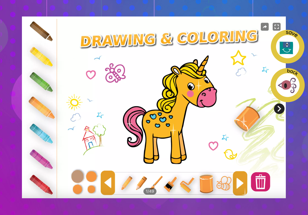
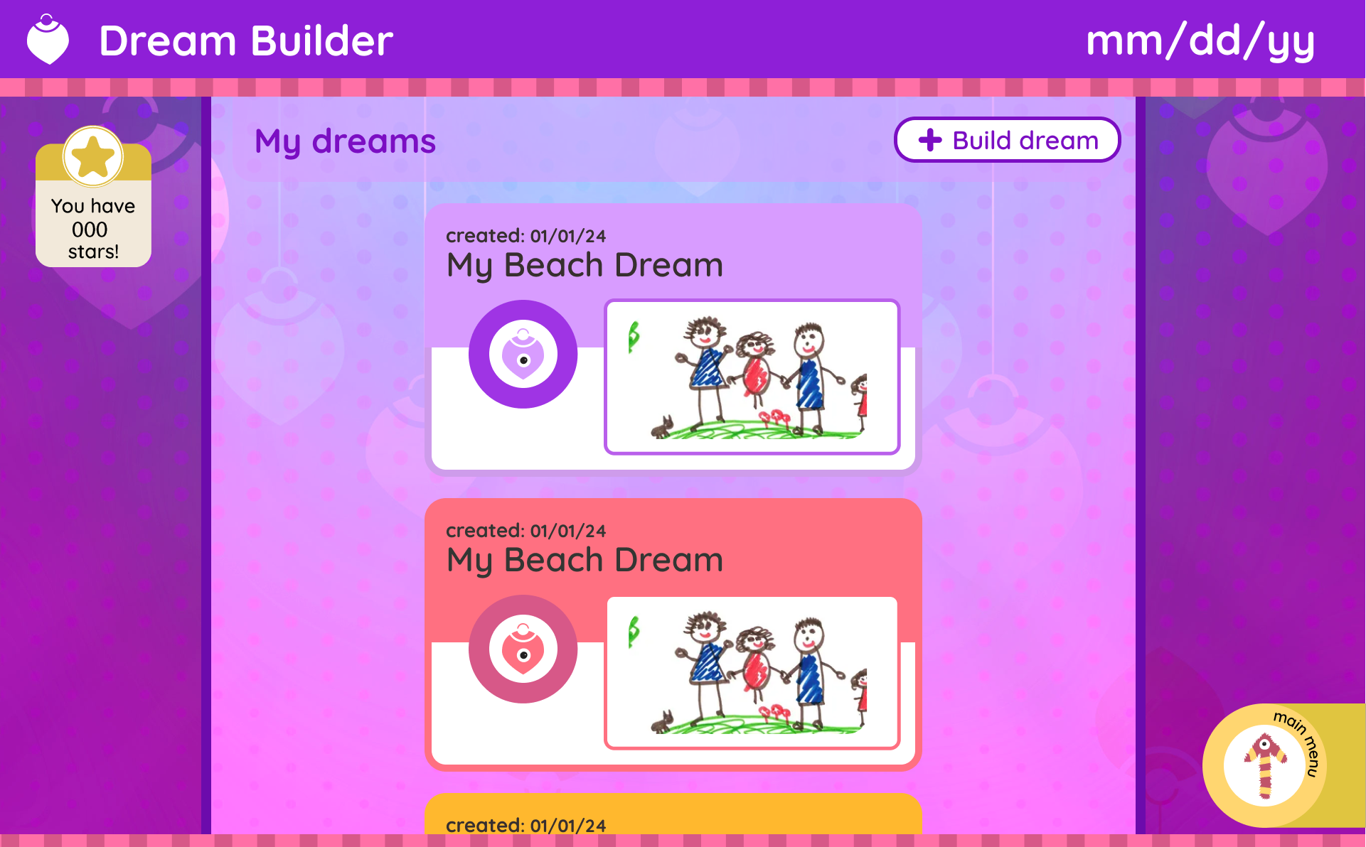
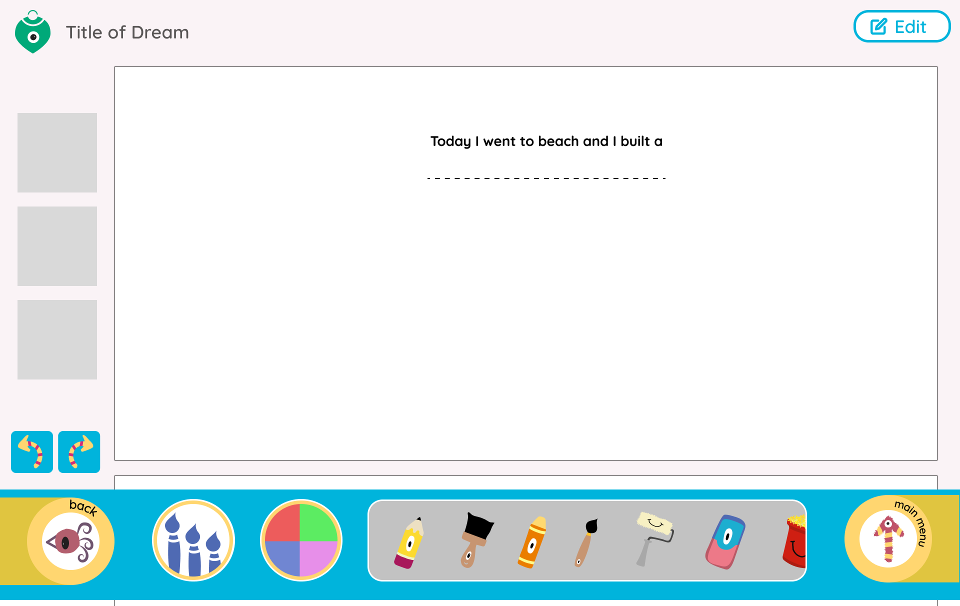
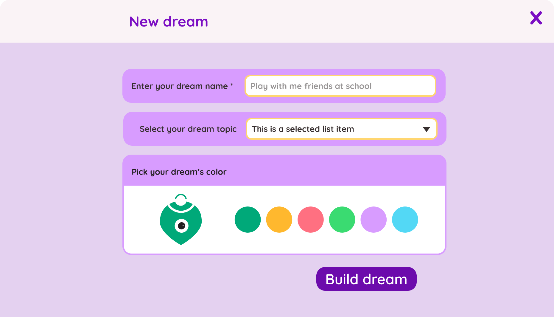
Dream Creation Flow
01Dream Creation Flow
↑ Mapped every step from 'I want to draw' to 'I'm done.' Found 4 places to collapse into one.
Layout Exploration
02Layout Exploration
↑ Garden status without cluttering home view
Interaction Concepts
03Interaction Concepts
↑ Kids need single-tap, not pinch & rotate
Creation Flow
04Creation Flow
↑ 4 levels deep → max 2 taps to anything
Component Patterns
05Component Patterns
↑ Where the design system started

New additions

As part of this redesign, I designed the user flow and interaction patterns for several new features that enhance engagement and create a more immersive AR experience. These additions involved detailed design work including wireframing, prototyping, and defining the visual language to ensure each feature felt cohesive with the overall app ecosystem.

AR Plant Garden Design

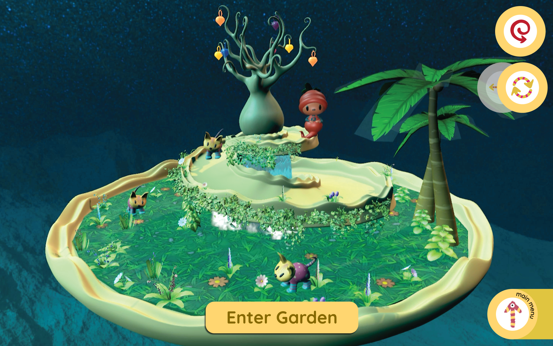
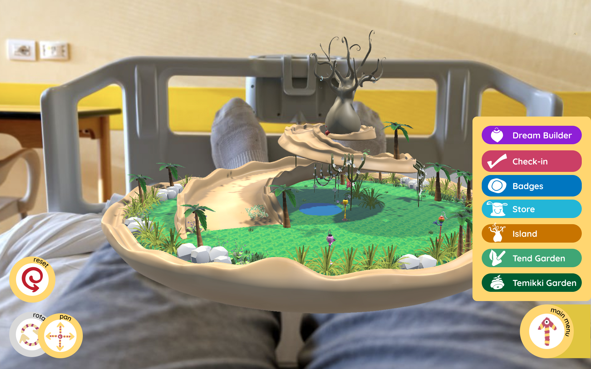
The Vision: Users could place virtual plants in their real space, but they needed to feel alive, not static. I helped design an AR garden where plants grow over time, react to your cat, and create a living ecosystem.

Landing view of the AR garden

Landing view of the AR garden

Plants arranged in the AR space

Plants arranged in the AR space

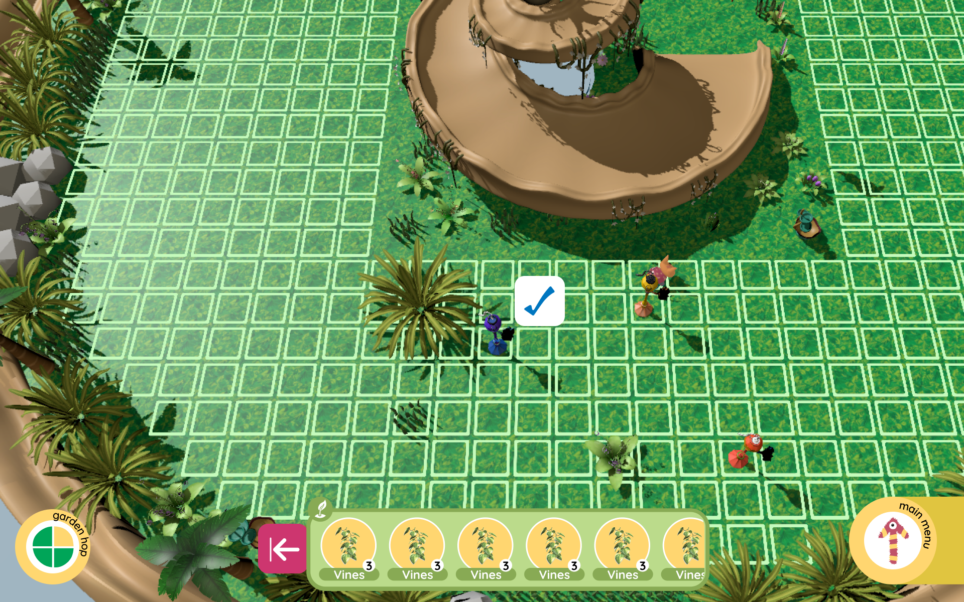
Grid view for placing and arranging plants

Grid view for placing and arranging plants

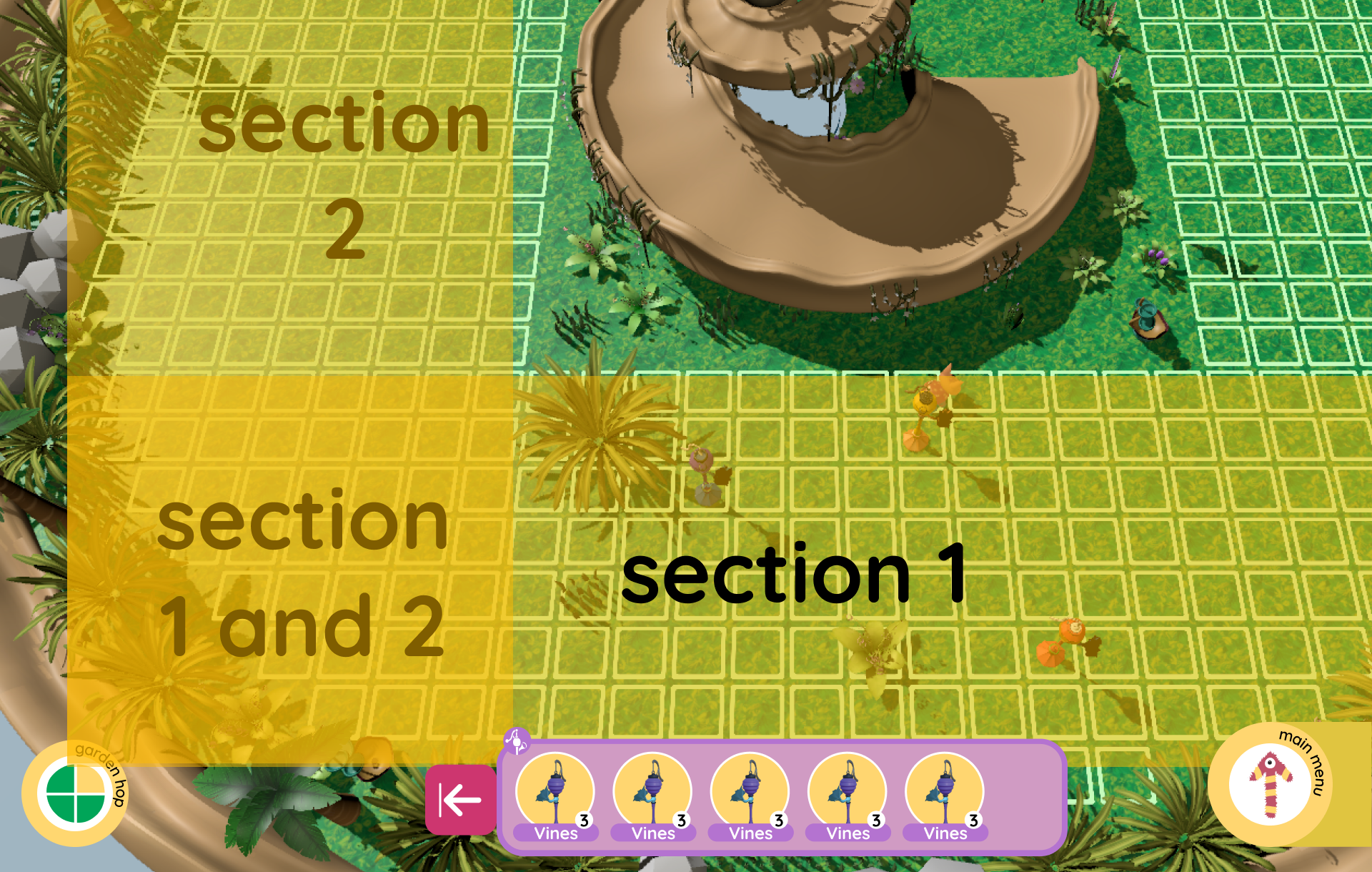
Immersive AR experience with virtual plants

Immersive AR experience with virtual plants

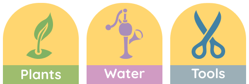
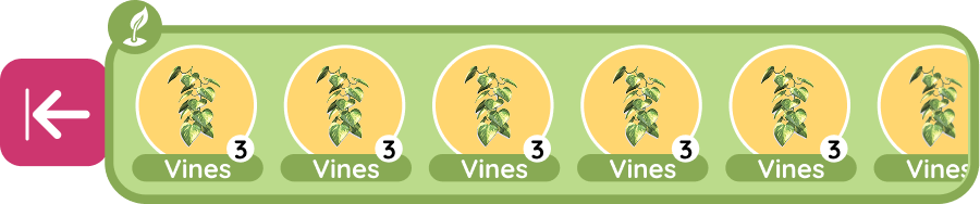
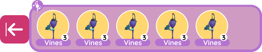
Icons designed for the garden

A custom set of dashboard icons I designed to support the AR Plant Garden — each follows the same rounded, friendly visual language as the rest of the app.

Dashboard
Dashboard
Layer 9
Layer 9
Plant Dashboard
Plant Dashboard
Water Pump Dashboard

Design Decisions: Each plant has 3-5 growth stages with subtle animations — leaves sway gently, flowers bloom in real-time, and some plants emit particle effects when your cat walks near them. The color palette uses soft greens and pinks to match the app's aesthetic while feeling natural in any room.

Why It Works: The garden becomes a persistent world users return to daily. They check on their plants' progress, rearrange them, and watch how their cat interacts with different species. It transforms AR from a novelty into a habit.

Badges & Achievement System

The Challenge: Users loved the app but lacked motivation to explore all features. We needed a way to celebrate milestones and encourage long-term engagement without feeling manipulative or game-ified in a cheap way.

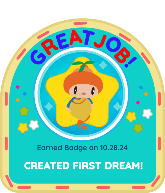
Created first dream badge
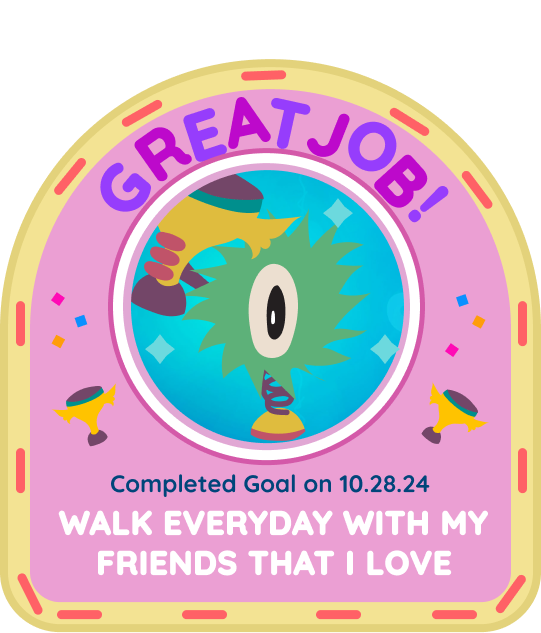
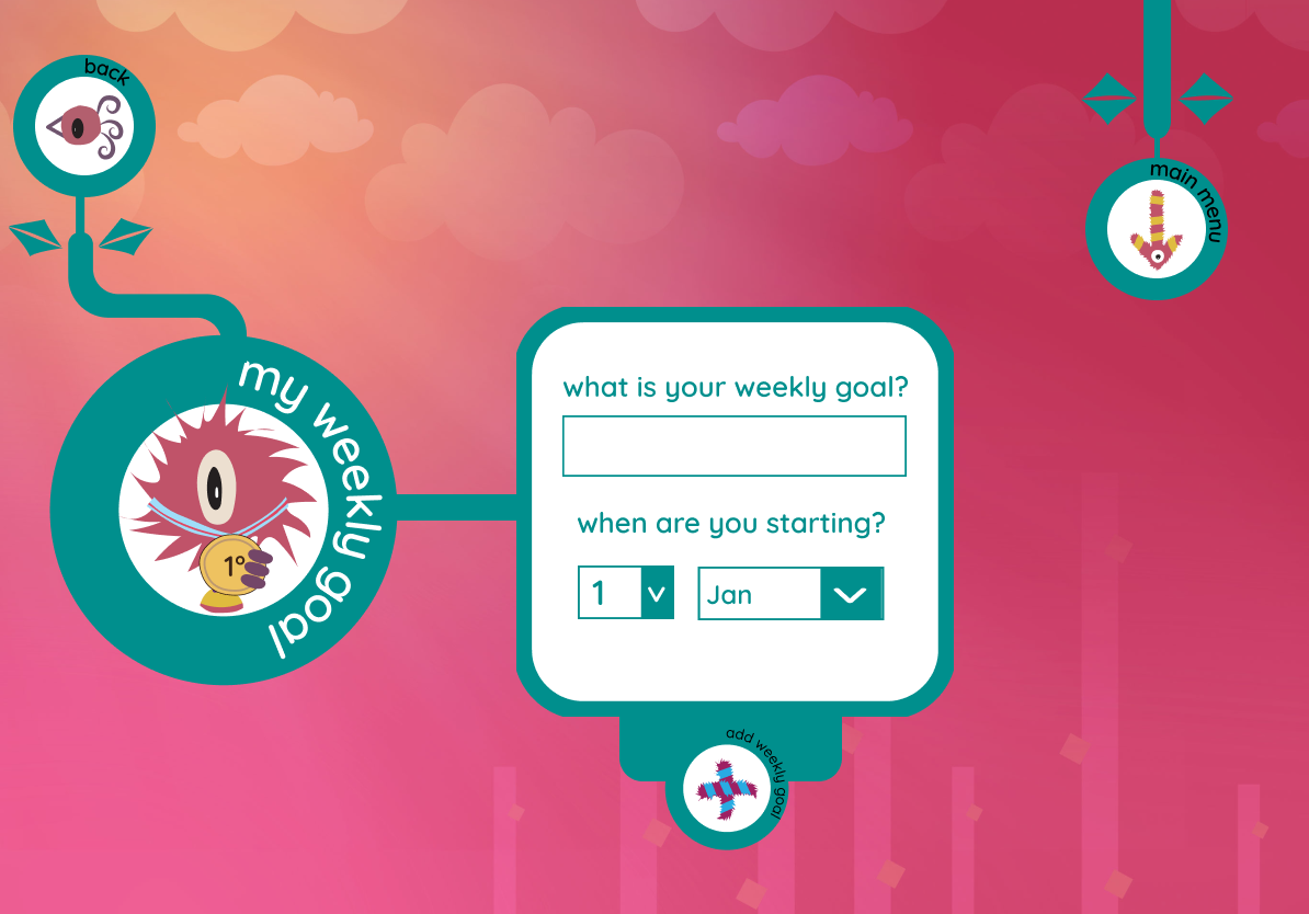
Walk everyday goal badge
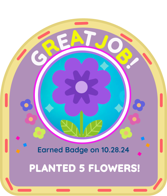
Planted flowers badge
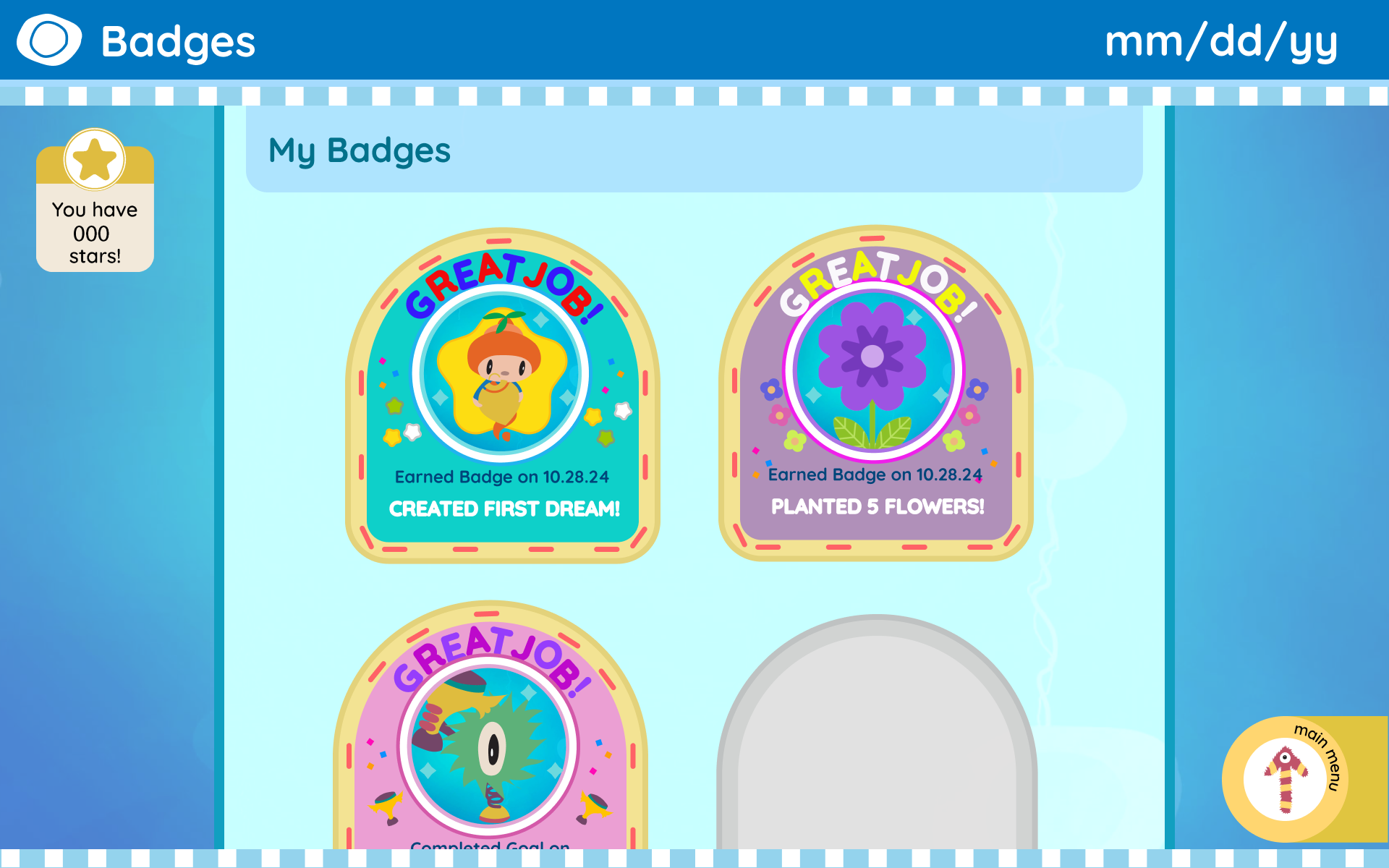
Badge collection screen

The Solution: I designed a badge system that feels like collecting pressed flowers in a scrapbook. Each badge has a unique illustrated design tied to the cat's world — botanical themes, soft colors, and whimsical details. Unlocking a badge triggers a gentle animation and stores it in a beautiful collection view.

Why It Works: The badges feel like natural rewards for exploration, not arbitrary achievements. Users describe them as "collectible memories" of their journey with their virtual cat. Completion rates for secondary features increased by 63%.

Before vs After
Side-by-side comparisons showing how the redesign addressed key usability issues.

01

Onboarding Experience

The transformation

7
screens before
1
screen after

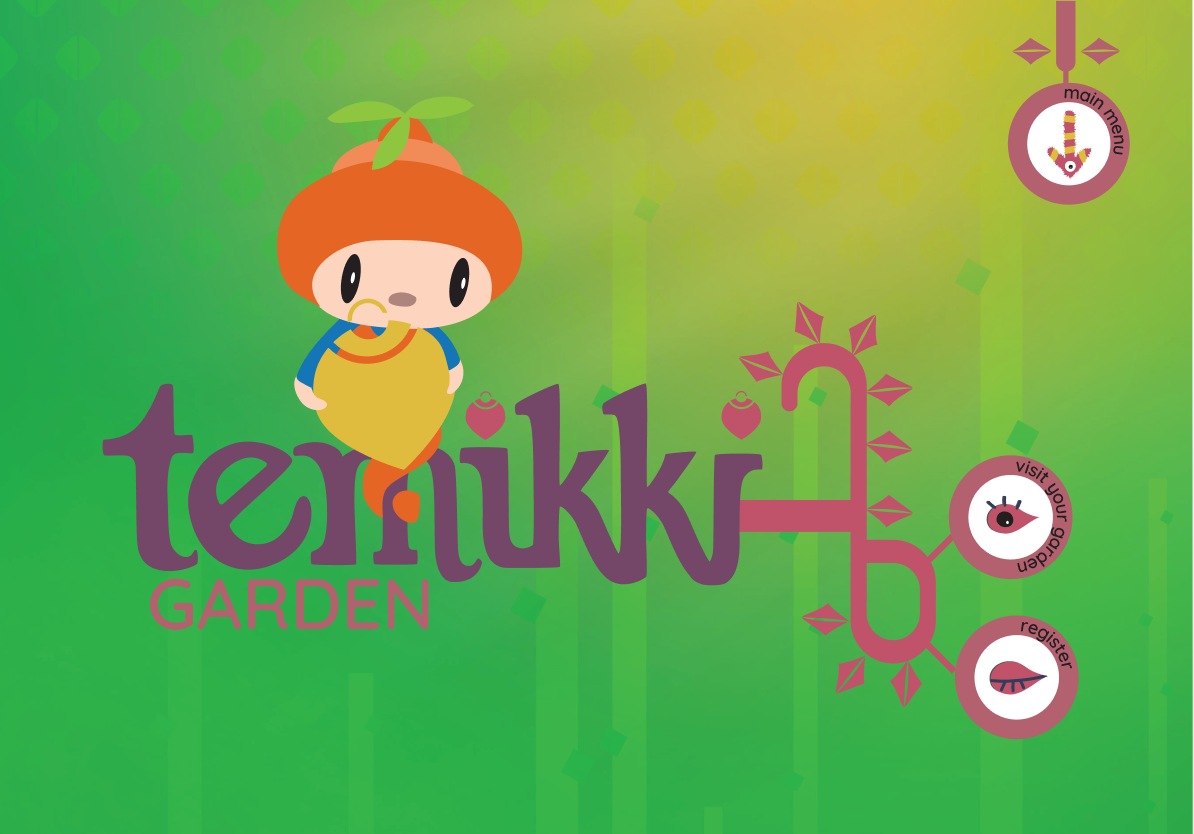
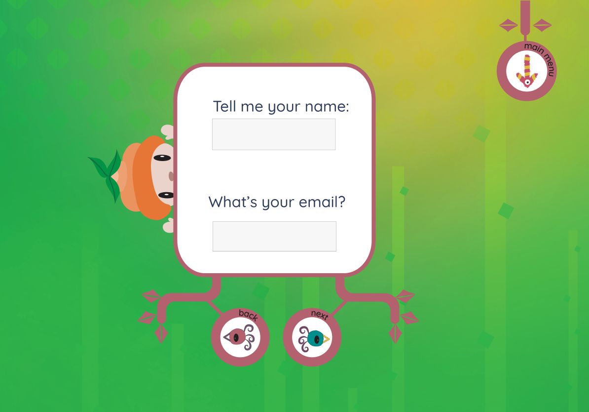
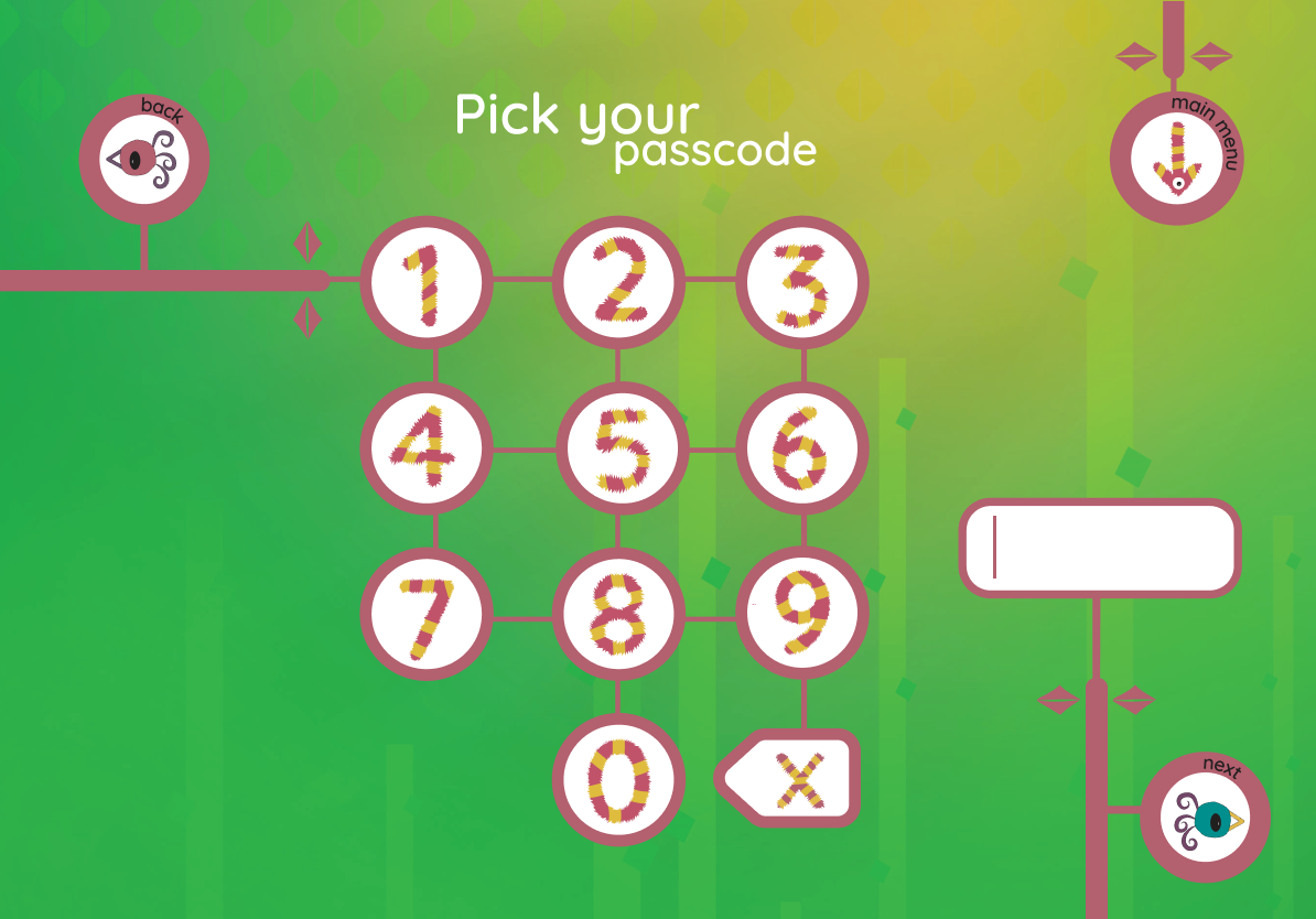
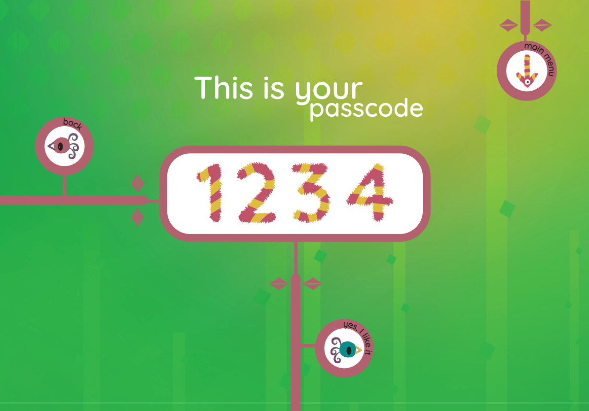
A child in pre-op had to tap through seven setup screens before they could draw a single picture. The redesign assigns tablets pre-configured — children open the app and play immediately.

Setup time: ≈90 seconds → 0 seconds👶 Adult-assisted → fully independent🏥 Hospital-ready out of the box

Before · 7 screens

Before onboarding screen 1Before onboarding screen 2Before onboarding screen 3Before onboarding screen 4Before onboarding screen 5Before onboarding screen 6Before onboarding screen 7
What got cut
User registration
Email verification
Avatar creation
Tutorial walkthrough
Permission requests
Profile setup

After · 1 screen

Final design
After: Final onboarding screen

Impact

Compare the experience
Tap to switch
Before

Overwhelming setup process
— 7 screens before children could start playing

Required adult assistance
— children couldn't use the app independently

Prevented clinical deployment
— not usable in hospital environments where independence is critical

Why this was a problem

Young children in stressful hospital environments needed immediate access to therapeutic play, but the complex onboarding created barriers at the exact moment relief was most needed.

After

Setup time eliminated
— tablets assigned with no login or avatar creation

Lower cognitive load
— fewer decisions for stressed children

Context-aware design
— usable in hospital settings without caregiver assistance

Why this mattered

In a hospital setting, children may be anxious, tired, or unaccompanied. Removing onboarding steps allowed immediate access to play without instructions, reducing friction and emotional load at a critical moment.

See the full breakdown
Why it failed
  • Decision overload — kids 6-10 can hold only 2-3 choices at once
  • Permission stacking — contradicted the promise of immediate relief
  • Clinical fragility — every step multiplied abandonment risk
Why the fix works
  • Local-only storage — no permissions, still COPPA-compliant
  • Smart defaults — accessibility through design, not stripping features
  • Spatial recognition — one screen replaces sequential memory
Click to expand the full breakdownClick to collapse

Before: Cluttered & Overwhelming

Before onboarding screen 1Before onboarding screen 2Before onboarding screen 3Before onboarding screen 4Before onboarding screen 5Before onboarding screen 6Before onboarding screen 7

Analysis

Cognitive load exceeded age-appropriate limits
children ages 6-10 can process only 2-3 decisions before decision fatigue sets in

Multi-step permissions created friction
contradicting the core value of immediate therapeutic relief at first use

Clinical context amplified barriers
in hospital settings, each additional step exponentially increased abandonment risk

After: Clear & Friendly

After: Final onboarding screen

Analysis

Privacy-first local storage
eliminated permission flows while maintaining COPPA compliance

Intelligent defaults and progressive disclosure
removed cognitive barriers — accessibility through smart design, not simplification

Single-screen spatial recognition
vs. multi-step sequential memory enabled immediate orientation

Transformed onboarding
from gatekeeper to invitation, aligning UX with therapeutic goals for time-sensitive clinical deployment

What I'd carry forward

In high-stress contexts, every onboarding step is a tax. The most accessible design isn't the simplest interface — it's the one that respects what cognitive resources the user has left.

Design Principles

🌱

Nature-Inspired

Garden and plant themes create a calming, therapeutic environment that promotes emotional wellbeing

🎨

Playful & Friendly

Rounded shapes, vibrant colors, and cheerful characters make medical tracking feel like play

👶

Child-First Design

Large touch targets, simple navigation, and visual communication prioritize young users' needs

Reflection

Empathy must drive every design decision when the user is a child in distress.

  • Beyond usabilitythe interface had to be a safe, comforting space where kids felt empowered to express their emotions
  • Visual over verbalchildren process pictures faster than text, especially when stressed
  • Context-driven testingresearch has to happen in the actual environment, not a sanitized lab
  • Multidisciplinary expands the toolboxcombining UX with 3D asset design made the experience more cohesive than either alone

Key Insights

Transferable principles I'd carry into any future design project.

01

Framing > features

The smallest copy choices carry the most weight.

  • Renaming "Medical Record" → "My Garden"changed engagement without touching the data
  • Reframing is cheaper than re-architectingand often more effective
02

Accessibility ≠ simplification

Stripping features rarely helps the user.

  • The drawing tool got more tools, not fewerand engagement tripled
  • Design's job is to lower the cost of startingnot the ceiling of what's possible
03

Context dictates the bar

"Friction" is relative to where and when the product is used.

  • A 7-step onboarding is fine for a banking appin a pediatric ward it's a wall
  • Always design for the worst momentthe user might encounter the product
04

Multidisciplinary design compounds

Disciplines reinforce each other when combined deliberately.

  • 3D characters + UI redesign + badge illustrationeach carried part of the message
  • A single discipline could have shipped a usable productcombining them shipped one kids loved

What I'd Do Differently

🧭

Lead the team out of the existing design more deliberately

I joined this project mid-flight, with no documentation, annotations, or user flows to inherit — only the founding investor's vision to anchor on.

  • I ran my own research to surface what was failing in the existing appbut the rest of the team remained mentally anchored to the old design while I was trying to chart a new direction
  • Reframing exercises, mood boards, and competitive teardowns happenedbut I didn't push hard enough to displace the team's frame of reference before moving into production
  • In a similar future engagement I'd run a structured re-vision workshop earlierco-creating the new direction with the team so they own the departure from the legacy work, rather than reluctantly accepting it
⚙️

Validate technical feasibility before refining designs

As lead designer, I underestimated how often the visual direction would need to be reworked once engineering hit platform limitations.

  • Designs were iterated repeatedly downstreambecause the dev team encountered AR rendering and performance constraints that weren't visible during the design phase
  • Polishing high-fidelity work that ultimately had to changecost the team velocity and shipped a less coherent final product
  • In future engagements I'd partner with engineering earlierasking them to spike technical primitives and validate the riskiest interactions before I commit to high-fidelity direction

Embed accessibility into the visual foundation

The aesthetic carries the brand — but as design lead, I should have set non-negotiable accessibility constraints before approving the palette.

  • The soft greens and pinks were aligned with the brand voicebut not every surface clears WCAG AA contrast under clinical lighting conditions
  • Motion sensitivity wasn't formally addressedanimations lack a graceful reduced-motion fallback for users with vestibular needs
  • I'd lead the next engagement by partnering with accessibility specialists during foundational token worktreating contrast and motion as design constraints rather than QA findings

What's Next

Ideas cut for scope, research questions worth running, and directions I'd take Temikki next.

🧑‍⚕️

Clinician dashboard

A read-only companion view for nurses.

  • Playful garden language for kidsstructured medical summaries for staff
  • Helps clinical teams act on the datakids are already entering
🎙️

Voice input

For pre-literate or fatigued children.

  • Log feelings verballywhen typing is too much
  • Temikki translates speechinto garden entries
👨‍👩‍👧

Family co-play mode

Siblings or parents tend the same garden remotely.

  • Turns solo therapeutic playinto a shared family ritual
  • Especially valuablefor kids in long-term hospital stays

Thanks for reading

Want to see more, or work together? Take a look at my other projects or reach out — I'd love to hear from you.